Last year Amsterdam design studio thonik released a new identity for the Netherlands’ leading cultural event, Holland Festival. Since then the world has remained on alert -turbulence, upheaval and outright violence have dominated the headlines.
edges of europe
In response, Holland Festival’s artistic director Ruth Mackenzie chose to include productions from countries like Ukraine, Syria, Russia, China and Mali in this year’s event.
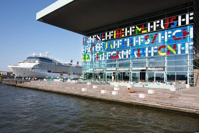
thonik used this more embracing and outward vision to build on the ligature* + stencil HF logo they designed last year. They extended the same technique by adapting it to the names of the countries represented in the programme.
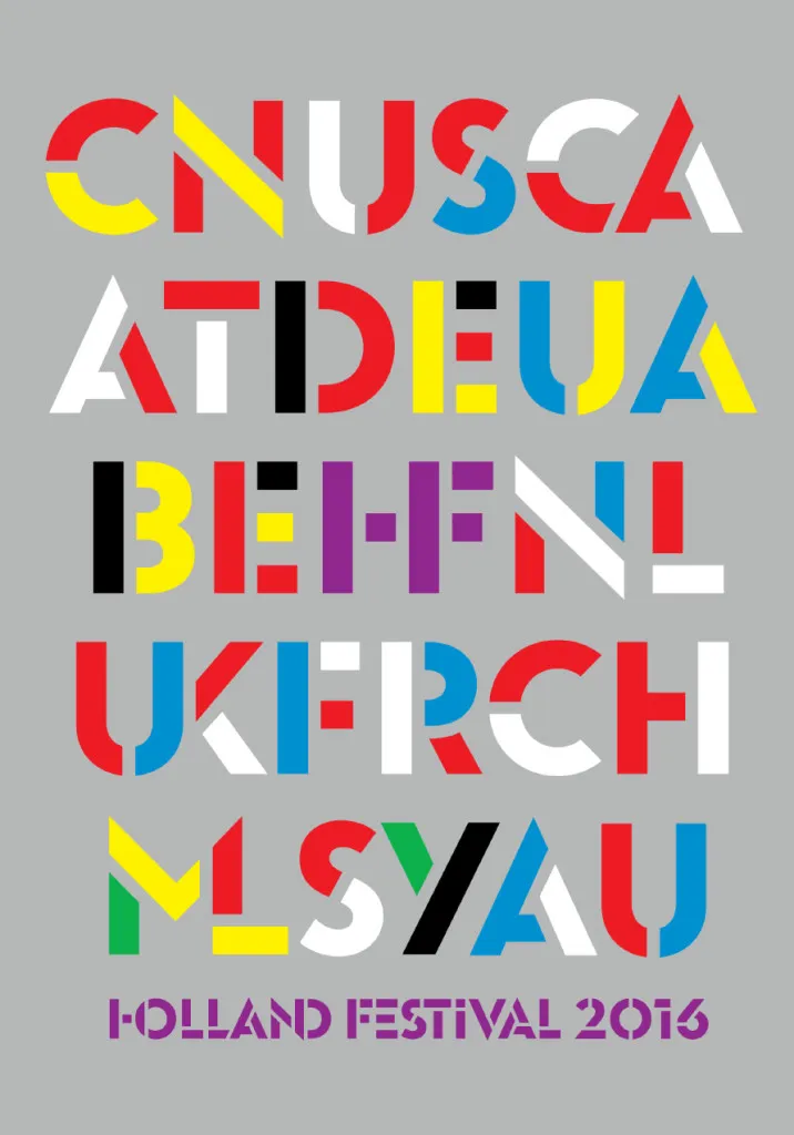
So alongside the HF of Holland Festival there is an ML for Mali, for example, and a UA for the Ukraine. For the poster campaign the HF is centered with the country abbreviations scattered around at a distance from the center that corresponds to that countries’ geographical distance from the Netherlands. The colours of these abbreviations correspond to the colours of the country’s national flags.
The result is an instantly recognizable Holland Festival identity that looks open, transparent, and international. It works across all mediums and the cut-outs from the stencilling makes it possible to also include images from the participating events to strengthen communication further.
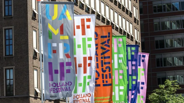
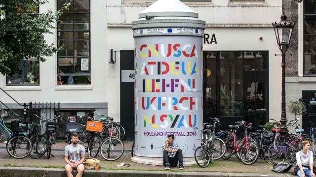
The typeface for this identity was developed by thonik in collaboration with font foundry Bold Monday. It starts with the Swiss typeface Euclid Flex, which is turned into a ligature then mixed with Milton Glaser’s 1970 stencil.
Further Info
Related Work
Holland Festival