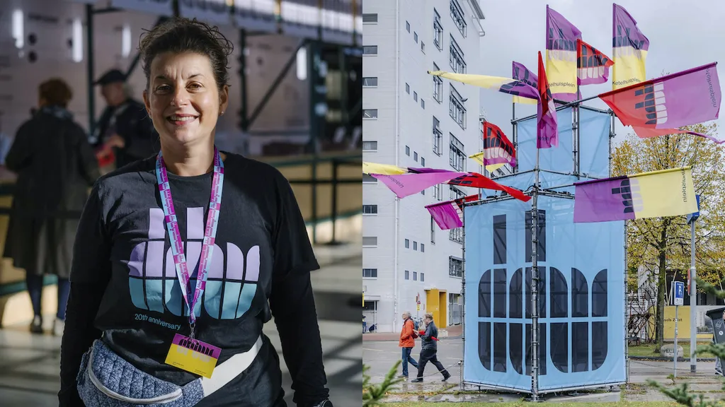
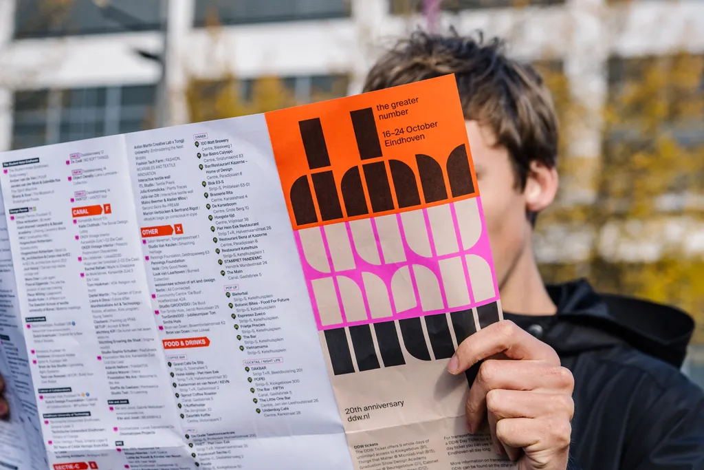
For the new Dutch Design Week brand identity Thonik gave the almost 20-year-old logo, DDW’s tulip, a second life by developing a typeface based on a poster by Dutch graphic design master Wim Crouwel.
new: identity for Dutch Design Week: a tribute to Wim Crouwel
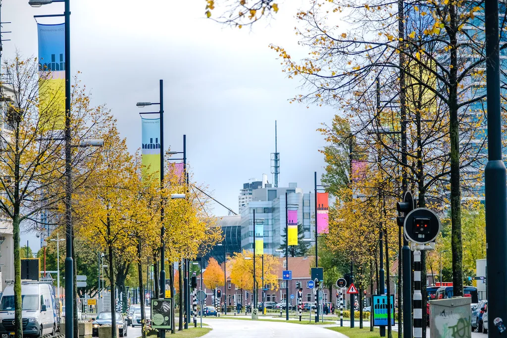
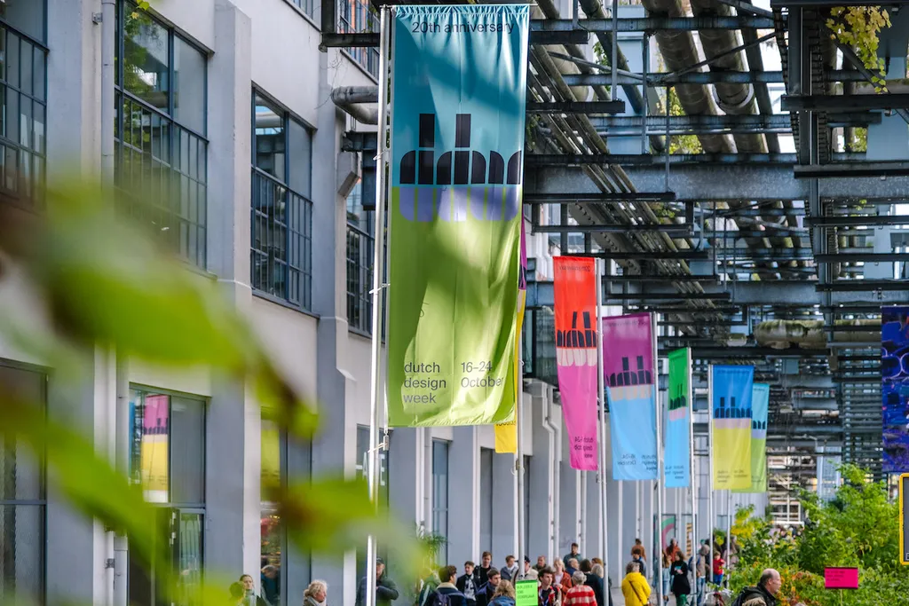
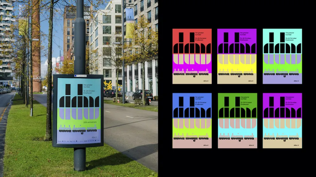
DDW’s tulip is a constellation of rectangles and quarter circles. These elements were also used in typographic experiments from the 1920s that were revised in 1963 by the late Wim Crouwel for the poster he created for painter Edgar Fernhout. It is this poster that studio Thonik took as inspiration for the new Dutch Design Week brand identity. Thonik expanded the 13 letters on the poster to produce an entire font. For this we teamed up with The Foundry Types. See article
Animating the newly developed font for the DDW site felt natural. When the letters started moving, the underlying grid became visually present. A bridge was forged between the aesthetics of the past and the design language of the future: motion design.
The Greater Number’ is a quest for the better number. With this theme, DDW on the one hand calls for less. Less consumption, less production, and therefore less waste. On the other hand, we know less isn’t always possible and that when it comes to more, it should be better. In other words, more sustainable products with more value, so that consumers deal with products differently.
Further Info
Related Stories
New typeface for Dutch Design Week