Museum Boijmans Van Beuningen and thonik celebrated their anniversary in November 2016. Ten years ago they launched the new identity. It is a milestone that makes both parties proud. And instead of cake, thonik made a little animation.
10 years boijmans and thonik
Back in 2009 Hugues Boekraad wrote an article about thonik’s design for Boijmans Van Beuningen.
For decades the graphic communications programmes of the larger Dutch arts institutions were under the spell of Swiss Modernism, characterised by a reduction and standardisation of graphic variables such as colour, format and typeface. The systems typography applied by Wim Crouwel in the 1960s and 1970s in publications for Amsterdam’s Stedelijk Museum represents the Dutch paradigm of this school of design. thonik’s house style for the Centraal Museum in Utrecht of the 1990s is also a variant of this approach, albeit a radical and playful one.
But in 2005 thonik’s commission for a house style for the new Museum Marta Herford in Germany under the directorship of Jan Hoet represented a break with this late Modernist style. The studio began with the design and incorporation of the museum’s logo into its building, designed by Frank Gehry-a happy marriage of architecture and typography. While the logo itself is made up of a common typeface, Swift, with a subtle deviation in the notation of the name, the core of the museum’s graphic identity programme is the tricolour alphabet designed by thonik, the Dreiklang or Triad. This triad of cyan, grey and magenta refers to the museum’s three components: a museum of contemporary art and design; a centre of information with educational facilities; and a forum for the arts. The decorative typeface based upon three lines in three colours appears in constantly changing configurations in the presentation of the museum’s activities.
thonik applied here for the first time two devices that are also at the basis of the house style for Museum Boijmans Van Beuningen. Firstly, the studio effected a shift from reduction towards complexity in the graphic variables and their rules of application. The second device concerns the relationship between the museum’s logo and the communication of its activities. For the logo, the museum’s name has been reduced to a simple typogram that plays a modest role in the overall graphic system. This system, visualised in the typography of the posters and invitations for the museum’s exhibitions, is rather the key component of the house style.
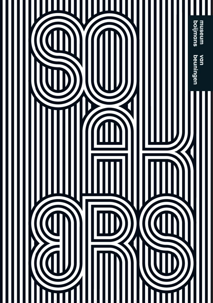
thonik’s design for Museum Boijmans Van Beuningen is also characterised by continuity and discontinuity in relation to the previous house style, designed by Mevis & Van Deursen. They based the museum’s logo on the digitised version of Mexcellent, a font derived from Lance Wyman’s emblem for the Mexico Olympics in 1968. Wyman’s design is a synthesis of three visual styles: the psychedelic style of New York’s subculture of the late 1960s, which resonates in the font’s continuous pattern of curvaceous lines; the symbolic signs of Mexico’s pre-Columbian cultures; and the systems typography of the International Style. His emblem formed a vital and vibrant symbol of the spirituality of ancient cultures united with the energetic optimism and idealism that a new generation manifested with such vigour in the West in the 1960s. Mevis & Van Deursen modified Mexcellent in several ways, freeing the letters from their background, straightening the rounded corners, shaping the typeface in three versions of either one, two or three lines, making the lines somewhat thinner and increasing the width of the internal white spaces. Little more remained of the original font than a neo-Constructivist shell, thin in form, aloof and objective in tone.
Surprisingly enough, thonik decided to retain Mexcellent as the starting point for Boijmans’ new house style. Or rather thonik returned to the original design that had served as the basis for Mevis & Van Deursen’s identity, undoing all the changes that they had introduced. Furthermore, thonik redesigned five letters by eliminating the diagonal strokes, thus emphasising the letters’ curvilinear character, restoring the font’s ornamental, exotic and rich aspects as well as its international dimension.
As at the Museum Marta Herford the typeface takes on a prominent place within the house style through the invention of ever-changing letter patterns, whose unpredictable contours contrast strongly with the stable logotype, set in the standard typeface Schulbuch Nord. Here too there is a move from reduction to complexity and an interplay between a standardised logo and the varied typographic treatment of exhibition titles and artists’ names. Within a simple grid the letters can expand in all directions, forming colourful coils and producing a fusion of background and typeface. Sometimes the letters take prominence and at other times they sink into the background. The choice of colour is entirely free and may contrast or harmonise with the colouring of the background image to which the letters are applied. But in each case the result is a fluid and lyrical graphic image. The typography is projected onto a setting, as it were-a block of colour whose contours are partly defined by the undulating letters, giving them a theatrical aspect. In this way the institution’s identity is anchored in the typography of its own productions.
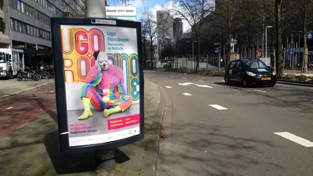
The house style is applied consistently across all the museum’s communications. Its most compact application is perhaps to be found in the invitation cards, approximately 25 each year. These cards have a dual character, on one side delivering clear information and on the other presenting typographic puzzles positioned against a representative image. Placed alongside one another, these typographic patterns form the motifs of a broader tapestry. Their cohesion is arrived, not through the mechanical repetition of identical elements in a modular system, but through weaving together related patterns in an ever-expanding whole. We could also say that the front of the tapestry shows the museum’s varied activities and the reverse displays their organisational condition: the institution of the museum.
The house style for Museum Boijmans Van Beuningen has provoked criticism that the typography is a rude stamp on the unique works of art displayed by the museum. This is sometimes considered to be a form of branding which is inappropriate in the art world. True, thonik has clearly been closely studying examples of successful identity campaigns by the communications office Kessels Kramer. What thonik has borrowed from them is not a typographic style or a visual strategy but rather aspects of the underlying communications concept, such as the blurring of the line between a corporate identity programme and a media campaign. For many years this dividing line separated two time zones in the world of professional communication: the longevity of the corporate identity and the transience of the media campaign. But it also divided two styles of communication: the stability and immutability of corporate communications, removed from the sound and fury of the street and the market place; and the alertness and aggression of commercial communications, focused on topicality and the fashion of the season. It should come as no surprise that, for decades, publicly funded institutions such as museums embraced the former communications style. But neither should it be so shocking that, when public institutions become independent, they incorporate elements from the latter style within their communications strategy. They do need to increase name recognition and visitor figures. Indeed it cannot be denied that thonik’s house style has made Museum Boijmans Van Beuningen much more recognisable in its communications, but it is not readily apparent why this should be seen as a grievance against it.
For that matter one might ask in what sense the term ‘branding’ is being used here. After all, not all graphic design that strives for recognisability through the repetition of conspicuous elements is a form of branding. In commercial communications, branding does involve a continual repetition of an identical form or image. Alongside a commercial brand’s function to create brand recognition and brand loyalty among consumers, it must also suggest the unchanging quality of a product. This is not the case with Boijmans; indeed, the opposite is true. The producer’s identity remains constant, but its productions are variable, short- term, small-scale and local. Their typographic branding is a question of (digital) handiwork tailored to every individual project- in each case a design puzzle of which the solution cannot be predicted.
I would therefore prefer to say that thonik mimics commercial branding. It appropriates a function of commercial communications and transplants it to the public domain. Most importantly, the thonik designers, precisely by adhering to the client’s communications aims and strategy, have broadened the playing field of their own professional practice. But their flexible, bespoke approach is diametrically opposed to the manner in which graphic design in the private sector is employed for the purposes of branding.
The museum is a visual arts institution in the public domain. In order to have a media presence it must both adapt to and simultaneously distinguish itself from the average information offer. The character of the institution must be visible in its representation.
Museum Boijmans Van Beuningen’s communications products are remarkable for their aesthetic quality. They distinguish themselves from the manner in which comparable museums present themselves to the public. In terms of visitor figures they appear to have been effective. By applying a marketing technique -branding-but implementing it within a flexible typographic system, Boijmans’ house style contrasts strongly with the formal language that prevails in commercial branding. In its innovative and experimental character, the graphic system developed by thonik connects with the productions that it brands: art in the broad sense of the word. In this way, Boijmans’ house style fits the museum’s self-image and its ambition as a ‘performing institute’: its identity is formed by the totality of its achievements.
Further Info
Related Work
museum boijmans van beuningen