graphic carpets

by Hugues Boekraad

Why are exhibitions of graphic design, however many good things there may be to see, seldom convincing as exhibitions? Hung on the walls of museum galleries, it is really only posters that can hold their own in their new, often monumental setting. 

graphic-carpets_7.jpg
Graphic Tapestries on show during the Venice Architecture Biennale, 2008.

They survive the move from one wall, where they did their everyday job, to the other, where they are displayed as aesthetically valuable objects, and usually get away with it-even though the transplantation from a once current street landscape to the timeless white cube of the average museum of contemporary art is an artificial intervention. But most other graphic utterances- books, postage stamps, folders and the rest-often look rather pathetic alongside them, arranged in display cases and protected behind glass from the viewer, whose inclination to leaf through them is thus frustrated. Ingenious as the specially designed structures in which they are sometimes presented may be, interested as the public may be in seeing the objects on show, the experience of a direct confrontation with an aesthetic object like a painting, an installation or a sculpture is usually missing.

Is this because, face to face with a graphic design that is often built up of a combination of images and characters, the visitor constantly changes attitude and focus? Because he switches from viewer to reader and back again, so that the aesthetic approach is continually interrupted by the irrepressible urge to read, that is to say by the impulse or desire to ascribe meaning to the characters? Does the aesthetic experience come to grief on the irreconcilability of two types of space: the two-dimensional space of typo-graphy and image reproduction and the three-dimensional space of display cabinet and museum gallery? Or is our disinterested enjoyment hindered by the perhaps vague feeling that what were are being shown here as unique objects are in fact copies, intended from the outset to be produced in large editions? If, having seen one or many repro- ductions of a work of art, one suddenly comes face to face with the original; this can generate an exciting sense of closeness that is usually lacking in the case of a mass-produced item.

graphic-carpets_5.jpg
Graphic Tapestries on show in during the Venice Architecture Biennale, 2008.

thonik’s idea of having carpets specially woven to serve as vectors of their designs for the exhibition in the Shanghai Art Museum is a refreshing experiment. To start with, they are implementing a remarkable change of scale: designs that were originally meant to be reproduced on a vehicle measuring 15 x 21 cm, for example, are now being produced on a 3 x 4 metre carpet. And it is not just the medium and the format that have changed. thonik have also introduced a different material and a different technique for reproducing the design. The paper or screen on which the original was produced has been re-placed by wool. And the design is woven, not printed or electronically duplicated. This transubstantiation of the graphic design creates a remarkable effect: the original designs remain what they were- copies-but woven in an edition of one, the graphic carpet becomes an original and unique specimen.

Anyone who enjoys fathoming the psychological motives behind the professional actions of a maker might suspect that vanity underlies these processes of according a design, executed as an edition, the status of a unique work. Did thonik’s designers want to acquire the coveted status of the artist by upgrading communication projects to works of art? On the contrary, it is evident from everything they do that their motives are very different. Above all, these motives have to do with the way this work relates to the exhibition concept.

graphic-carpets_4.jpg
Graphic Tapestries on show in Spiral Art Centre, 2009.
graphic-carpets_1.jpg
Graphic Tapestries on show in Spiral Art Centre, 2009.

thonik is one of the few Dutch design studios to carry out major assignments in two sectors of the public domain that most artists and designers would regard as being miles apart, if not totally opposed: the political power sector (government and political parties) and the cultural sector (cultural institutions and culture producers). The themes of the carpets have been chosen so that these four categories are represented. The exhibition title, Power. Forms of Engagement, also reflects thonik’s multifaceted relationship with the phenomenon of power. Drawing on the rich resources of its image archive, thonik chose two extreme poles of the area of power between which the studio’s commissions move: the symbolic might of the Queen in the Dutch constitution, and the political power of the Dutch Socialist Party, a modern left-wing opposition party, currently the country’s third largest; this party specifically advertises itself as a party of and for the people. Commissioned by the Amsterdam local authority, thonik designed a series of twenty-five posters on the occasion of Queen Beatrix’s silver jubilee; for the Socialist Party thonik designed a house style and a varied series of designs for three election campaigns. These projects are analyzed in detail elsewhere in this catalogue. The idea, at present, is that they will be shown on two facing walls in the museum in Shanghai. Sixteen carpets will be rolled out between them over the full length of the room. They will cover and span the distance between Monarch and People. According to Machiavelli, it is only thanks to this distance that the sovereign can get to know the people, while conversely one must belong to the people to get to know the sovereign. But in political communication it is not about insight into what a sovereign is and what a people is, but about the representation of desired self-images of both in an arena which is neither the people’s nor the monarch’s. This arena is that of the public domain. And this domain is pre-eminently the workspace of the thonik design studio. What they present alongside their clients’ self-images is their own power over images and signs. Only by engaging with holders of true or symbolic power does the designer get the opportunity to wield his own professional power. No matter how relaxed the relationship between client and designer, in every relationship involving a commission there is also a balance of power. This applies when the client occupies a position in the political power arena.

The carpets for Shanghai show fragments from thonik’s recent oeuvre, but are also the results of a contemplation of it. The business of a graphic designer, which in the days of the mechanical reproduction of the text luxuriated in the peace and quiet of the library, is nowadays subject to the speed with which the messages are absorbed and distributed by the media. This speed also dictates the time available for the design, production and reception of signs and images. The invitation to show work in Shanghai offered thonik a welcome reason to escape from this maelstrom of signs and images for a while, and to consider the question of what ought to be presented and how.

graphic-carpets_3.jpg
Graphic Tapestries on show in Power, Shanghai Art Centre, 2008.
graphic-carpets.jpg
Graphic Tapestries on show in Power, Shanghai Art Centre, 2008.

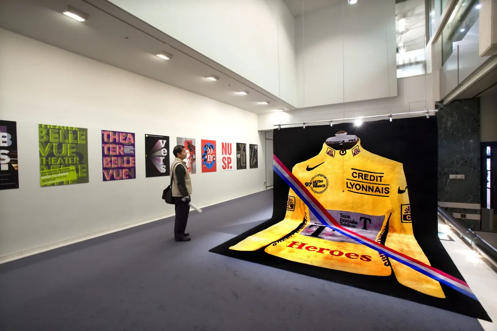
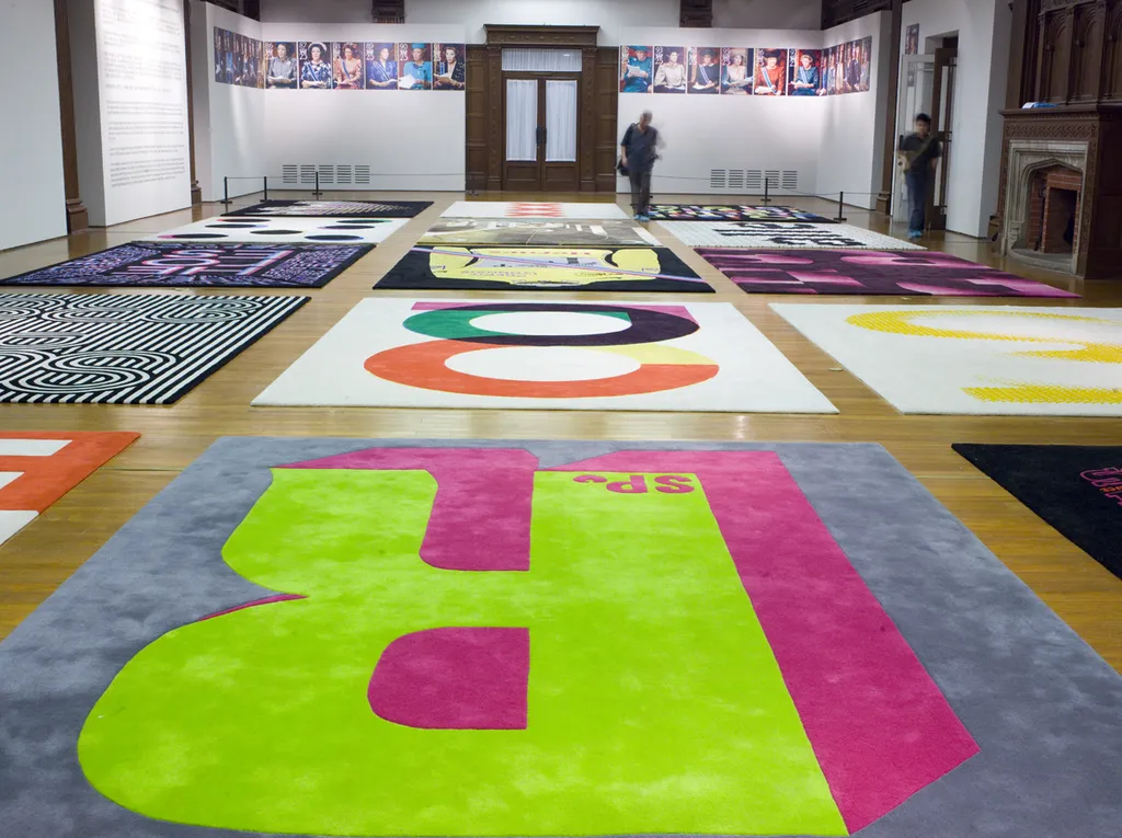
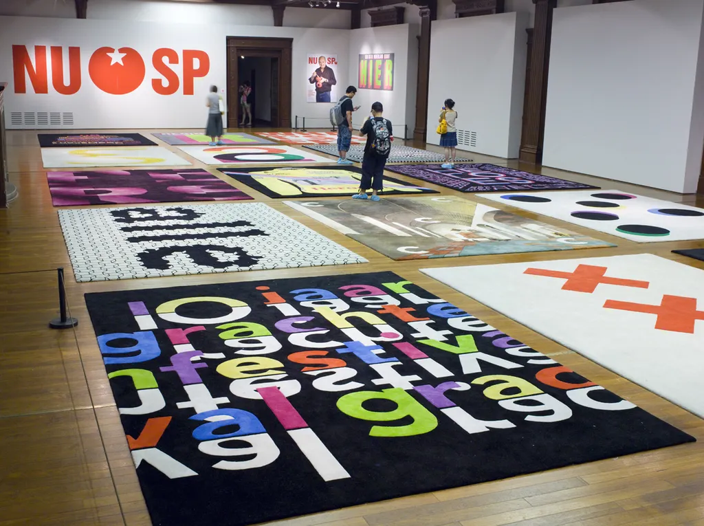
The carpets, a series compiled from existing designs and fragments of them, will function as sub-signs of a super sign. Thanks to the opportunity of getting this new work made in the form of carpets by Chinese carpet weavers, it was again possible to install the separation of concept and completion that lies at the foundation of the conceptual design method thonik has employed from the outset. Data from the studio’s digital image archive are being electronically transferred to Chinese carpet weavers, who will transform them into monumental objects.

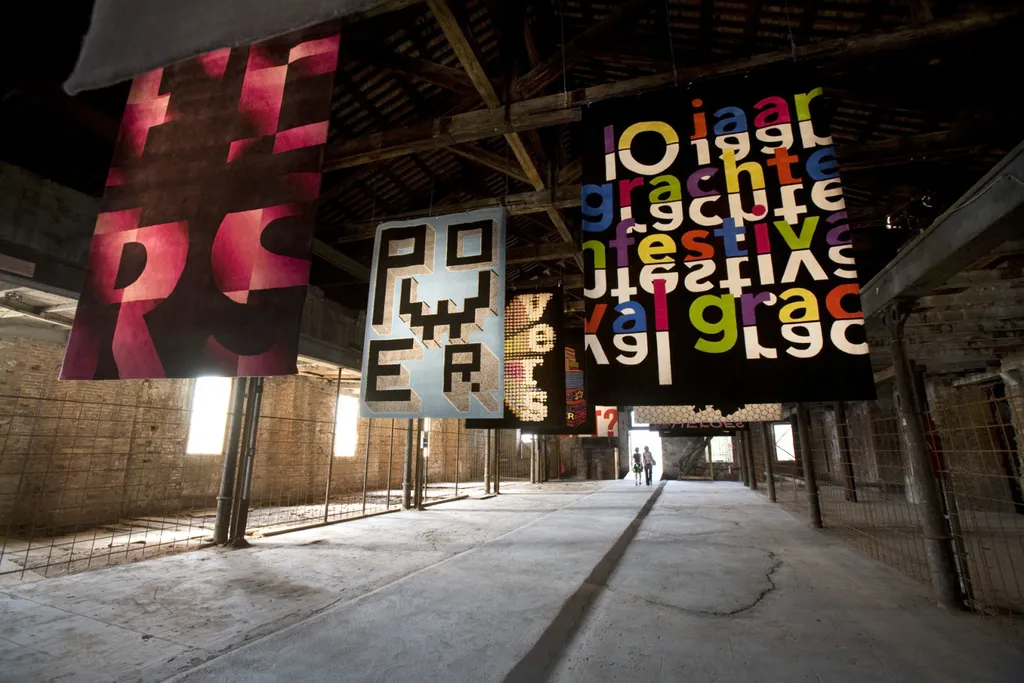
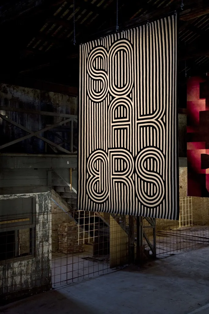
Indeed there is hardly any other medium that finds itself at a greater distance from modern-day design practice and the modern media than the carpet. The tempo at which the woven thonik designs are perceived is slowed by increasing their size. The designs now fit the dimensions of the space in the museum they will inhabit. The carpet as medium offers the designers the opportunity to literally objectify their own work, to increase the distance to it, thus creating space for reflection and analysis.

This space also comes about because sixteen designs, originating from various projects, are being taken out of their original context and brought together in a new composition.

As we have seen, the selection of the projects was based on the categories of clients thonik works for, but it also aims to show examples of processes that are characteristic of the design method thonik has used in recent productions. This reflection on their own actions as designers takes place here not in a philosophical vacuum but by initiating a new type of design.

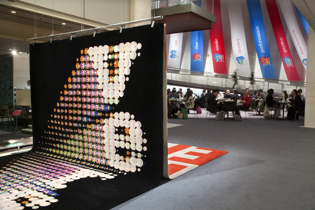
The visitors to the exhibition have something to gain from it too. The basic vocabulary of the thonik language is presented in the sixteen carpets. This begins with the focus on the elementary sign and continues into the development of a graphic system in which the shape of the text takes over from the logo. In some carpets it will be possible to see how a graphic system is applied, either in an image or to create an image itself. And lastly, the carpets will demonstrate various processes for ornamenting the font or word picture. The visitors to the museum are invited, wearing slippers with the title of the exhibition on the sole, to step on to thonik’s work. Walking on, between and beside the thonik carpets they will experience an immediate sensory and physical relationship with a work which, seeking information or inspiration, they will otherwise only get to know through reproductions in design magazines and books.

See also