by Adrian Shaughnessy
A chromatic visual identity for M+, Hong Kong
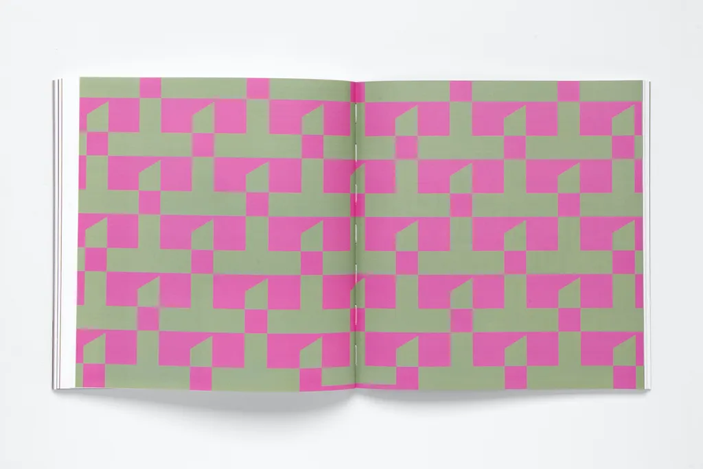
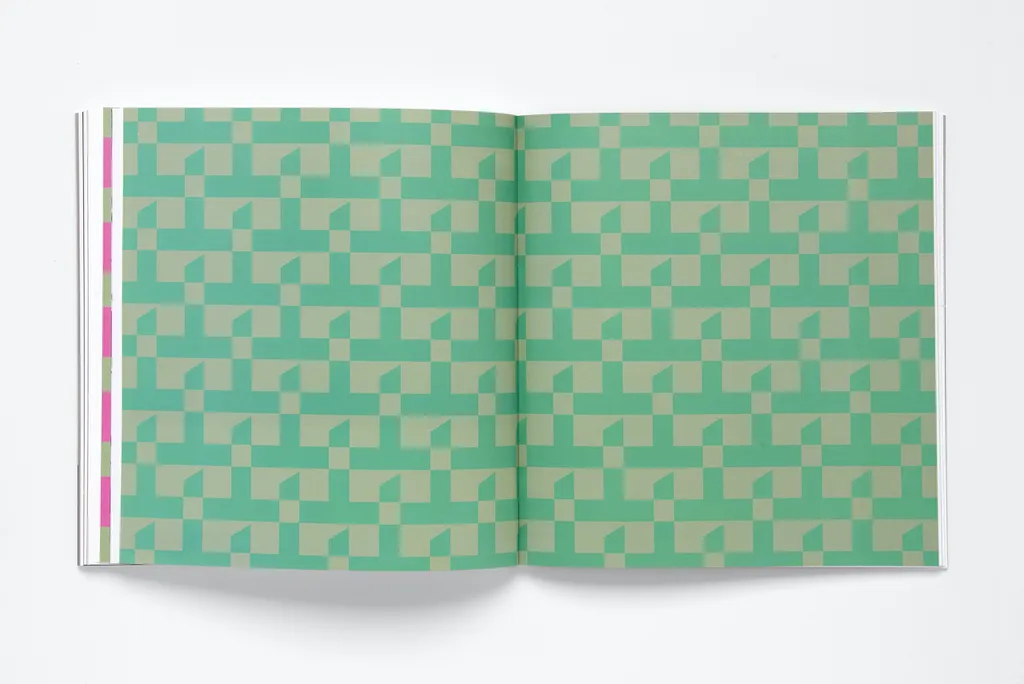
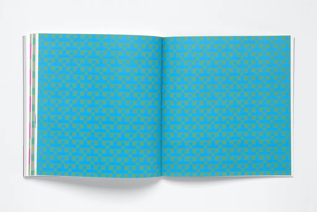
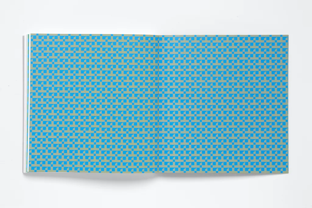
Thonik has an admirable track record in the use of vibrant and dynamic colour. It was one of the factors that brought them to the attention of the new M+ cultural centre in Hong Kong. Dedicated to 20th and 21st century visual culture., the centre’s distinctive M+ logo had already been designed (by UK design group North), but Thonik was invited to create a visual identity that worked across the institution’s physical and digital platforms. The purpose-made M+ building, by architects Herzog and DeMeuron, is an outstanding example of contemporary architecture. The logo and Thonik’s visual language took inspiration from the building’s singular geometric shape (an inverted T). Thonik infilled it with a palette of tonally equal colours, in ways that are aesthetically pleasing, memorable and practical. Graphic designers often choose colours based on personal preference. Thonik, by contrast, use a research-based process to make colour selection. Paradoxically, despite being rooted in scientific, technical or cultural enquiry, the outcome always feels logical and unforced – it’s as if, once it’s done, there could be no alternative. To devise a colour strategy for M+, Thonik turned first to the internal workings of the human eye, and then to the experiments of the colour theorist and Bauhaus teacher, Johannes Itten. They also brought their own innate ability to use colour to create identity, and to introduce something they call a “visual tickle”. The human eye, with its biologically engineered rods and cones, working in concert with our brains, enables us to experience a near infinite variety of colours. The rods feed a black and white image to the brain; the cones send a colour image. Thonik mimicked this complex process of “seeing” and derived a system for selecting a range of specific colours – neither too dark nor too light – that formed the basis of the M+ visual identity. Testing and prototyping play an important role in the Thonik design process. As Creative Director Thomas Widdershoven notes: “The way we test colours is by making them in photoshop in an RGB file, then adding to the colour a patch of 50% black, then turning the document to grayscale and checking the difference between the two patches.” The M+ visual identity uses a range of mid-tone colours. These colours are selected to be tonally equal to 50% black. When they are used as backgrounds for text, black or white lettering will always be legible. The M+ colour wheel (shown here) demonstrates the changes made to the primary colours to make a series of mid-tones to form the M+ colour set.
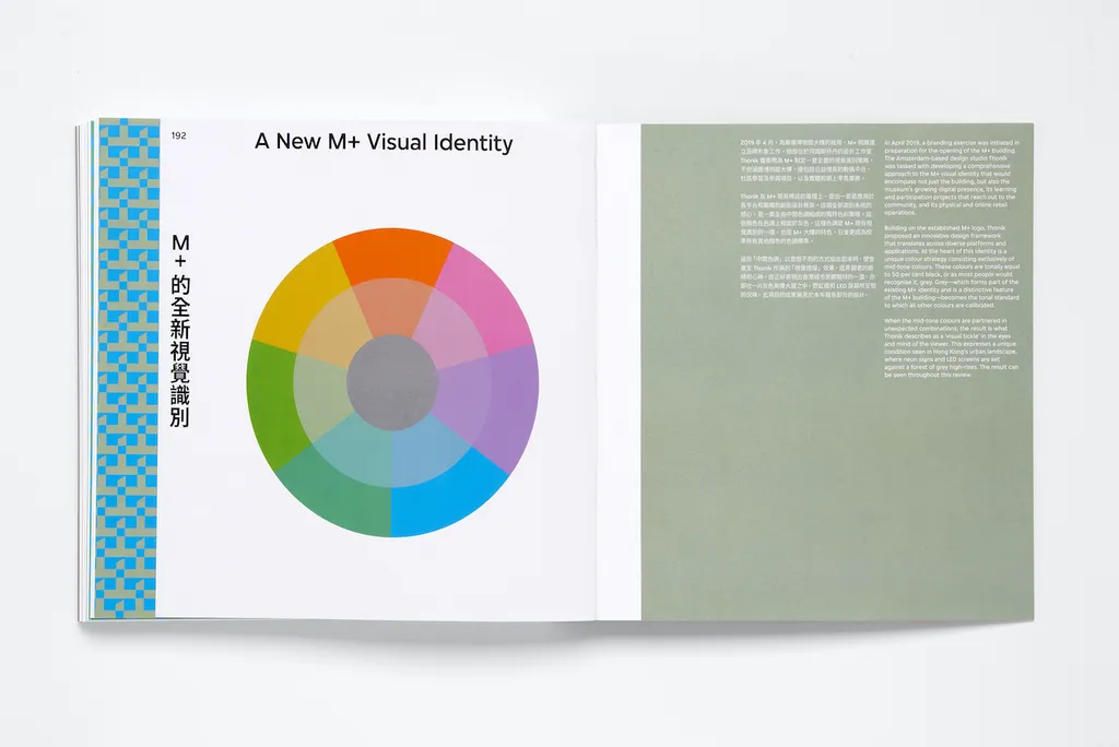
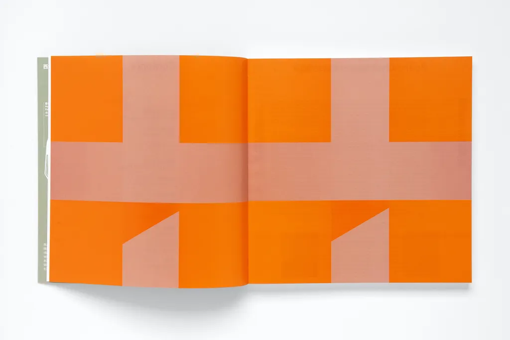
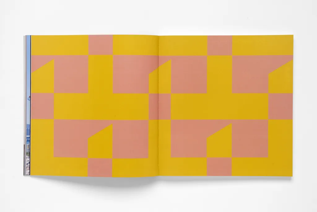
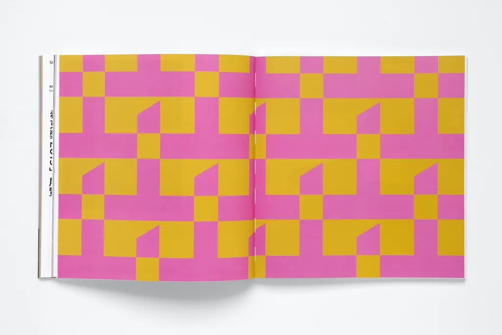
Some colours are too bright and others are too dark to make usable mid-tones. Yellow, for example, is too bright, ensuring that when white text is used, it will be illegible. For Thonik, the solution is to darken the yellow. By contrast, the purple is too dark, therefore needs to be lightened to make black text legible. Red is not suitable either – black text doesn’t work satisfactorily on red – so it is turned to pink. All colours in the M+ chromatic range are tonally the equivalent of 50% black – the grey at the centre of the wheel. This is the tonal standard that all colours are calibrated to. By using this selection criteria, Thonik developed a huge range of colours, equivalent to about 1000 Pantone colours. And when this palette of mid-tones is used in unexpected combinations, the result is a “visual tickle” in the eyes and minds of the viewers. And of course, a striking and unusual visual identity for M+. Increasingly, the reality of contemporary visual communication is the need to function across different media platforms – digital, print, online – each with its own colour output system. Another advantage of Thonik’s colour strategy for M+ is that by using only mid-tones, no matter what the delivery system, the results are always pleasing and functional. The effect can be seen in the examples shown here. The vibrant, arresting use of colour creates a varied and memorable brand identity for a progressive and design conscious institution. The range of colours throws up some unlikely partnerships, which has the same effect as a tickle – it makes you smile.
Further Info
Photos
Kimberley Zondag