It is an honour to develop a typeface for our city and it is very special that we have been working for the City of Amsterdam for over twenty years and that the organization continues to invest in openness, readability for all groups in society and continues to adapt to changing times.
a new typeface for the City of Amsterdam
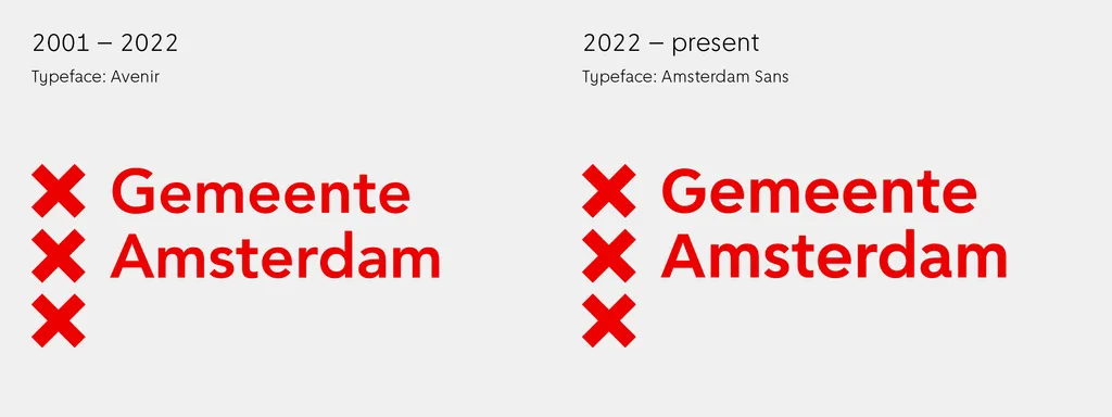
When Thonik started to work on the identity of the City of Amsterdam in 2001, we applied the Avenir by Adrian Frutiger as the main typeface. We saw it as a clear expression of the city’s key values: open, active and just. With its round ‘o’ and ‘e’ it has a geometric aspect that fits the geometric three crosses of Amsterdam’s logo.
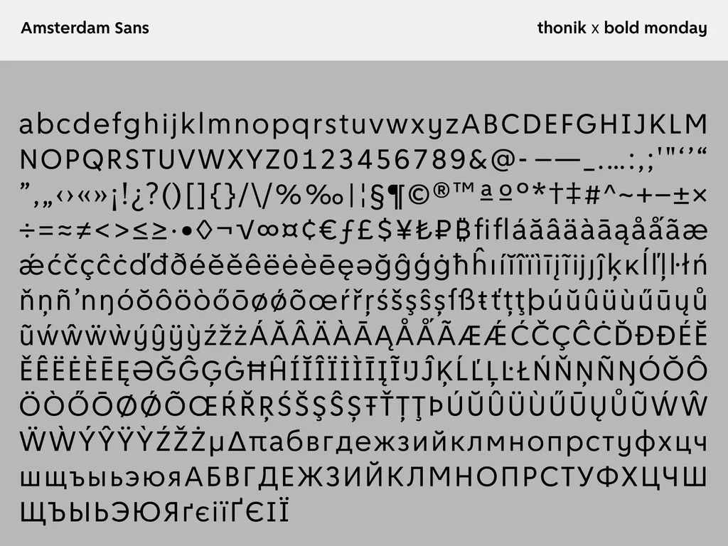
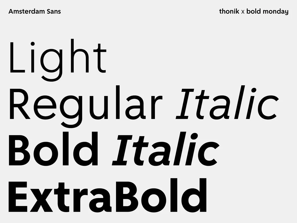
This year we developed together with Bold Monday a new bespoke typeface for the city: Amsterdam Sans. In the last twenty years more and more communication is screen based and the Avenir, with its extreme long ascenders, is not so ideal for that.
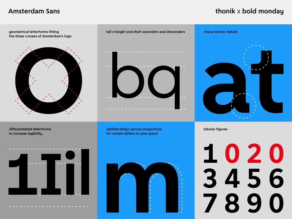
The Amsterdam Sans is designed in such a way that it looks like a continuity of the Avenir, but it is better suited for communication on screen, takes less space, has its own distinctive characteristics and is easier to read.
With Amsterdam Sans we celebrate our love for typefaces, 30 years of experience, and 15 years of collaboration with Bold Monday.
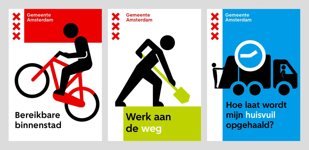
Would you like to see Amsterdam Sans in use? Go to www.amsterdam.nl
Further Info
Related Stories
gemeente amsterdam
Collaboration
Bold Monday