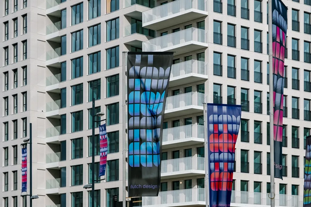
Thonik updates Dutch Design Week’s graphic identity for 20th anniversary
Amsterdam studio Thonik took cues from the typography of graphic design legend Wim Crouwel to create a fresh identity for Dutch Design Week, marking two decades since the inception of northern Europe’s largest design festival in Eindhoven.
The branding takes cues from a seminal poster designed by Crouwel for an exhibition on Dutch painter Edgar Fernhout, which was held at the city’s Van Abbemuseum in 1963.
The poster features Crouwel’s specially designed Fernhout typeface – a collection of 13 chunky grid-based letters formed using quarter circles.
Thonik updated the identity for Dutch Design Week (DDW) using the characters featured on the poster and worked with London-based type foundry The Foundary Types to design the remaining 13 letters and complete the alphabet.
read the full article on Dezeen.