Thonik creates colourful visual identity for Hong Kong’s M+ museum
M+ on Dezeen
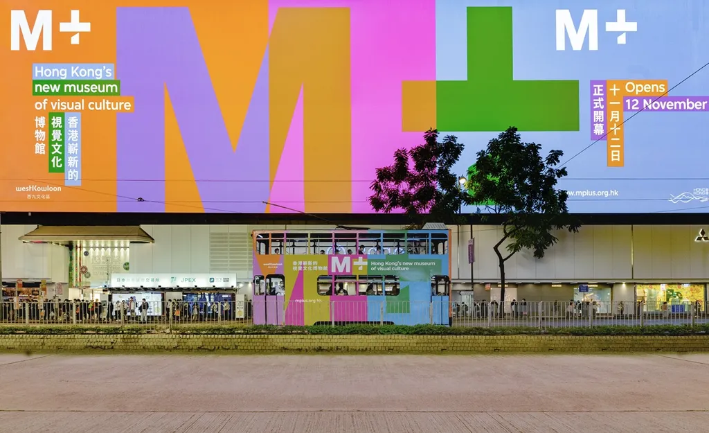
Dutch design agency Thonik has created a visual identity for the M+ museum in Hong Kong featuring a range of vibrant colours influenced by the city’s architecture and neon signage.
The integrated design system by Thonik will be used for the museum’s online, offline and onsite communication.
Used in conjunction with a logo designed by British design firm North, the identity is intended to be recognisable, practical and representative of the institution’s intercultural focus.
The project, which is shortlisted in the graphic design category at Dezeen Awards 2022, uses a range of mid-tone colours that recall Hong Kong’s urban fabric, including the neon signs and screens used by advertisers.
“A unique colour concept bridges vibrant green, blue and orange with softer tones and grey,” the studio explained.
“It is a conceptual colour set that fits the vibrant neon colours that are so typical for Hong Kong with the grey of high-rises of the big city.”
read the full article on Dezeen.