Netherland’s leading cultural event Holland Festival has unveiled its new graphic identity designed by thonik. The identity marks the beginning of Ruth Mackenzie’s tenure as creative director.
new identity holland festival
The Holland Festival has a strong tradition of graphic styles that reveals much about the history of Dutch graphic design – its colourful personalities and intellectual movements.
In 1995 Anthon Beeke adopted an austere, conceptual style for the event. He removed letters from the title, which was the first step towards using a logo. Based on this, Holland Festival was able to apply branding techniques by merging a commercial strategy with cultural communication.
In 2005 Maureen Mooren and Daniel van der Velden – the last graphic designers to work on the Holland Festival – radicalized Beeke’s paring back even further to create the simpler HF logo.
“A logo is the simplest way of becoming recognized in the deluge of commercial signs and symbols we face every day,” says thonik’s co-director Thomas Widdershoven. “It is about becoming as visible as possible in the public domain where commercialism is the spoken language. And to work, the logo has to connect a visual quality with context and content.”
thonik took the HF logo and combined it into a ligature*. Early investigations focussed on whether it was possible to make this abbreviation without alienating current audiences or confusing new ones. The team wanted to connect to this much-feted Holland Festival tradition of elimination, albeit with its gaze on the future.
The first results of the ligature made graphic sense, but were illegible and unclear. More elements needed to be deleted for the full strength and clarity of the concept to shine. So, after joining everything together they needed to find a way to rip it back apart. They found their solution in Milton Glaser’s 1970 stencil.
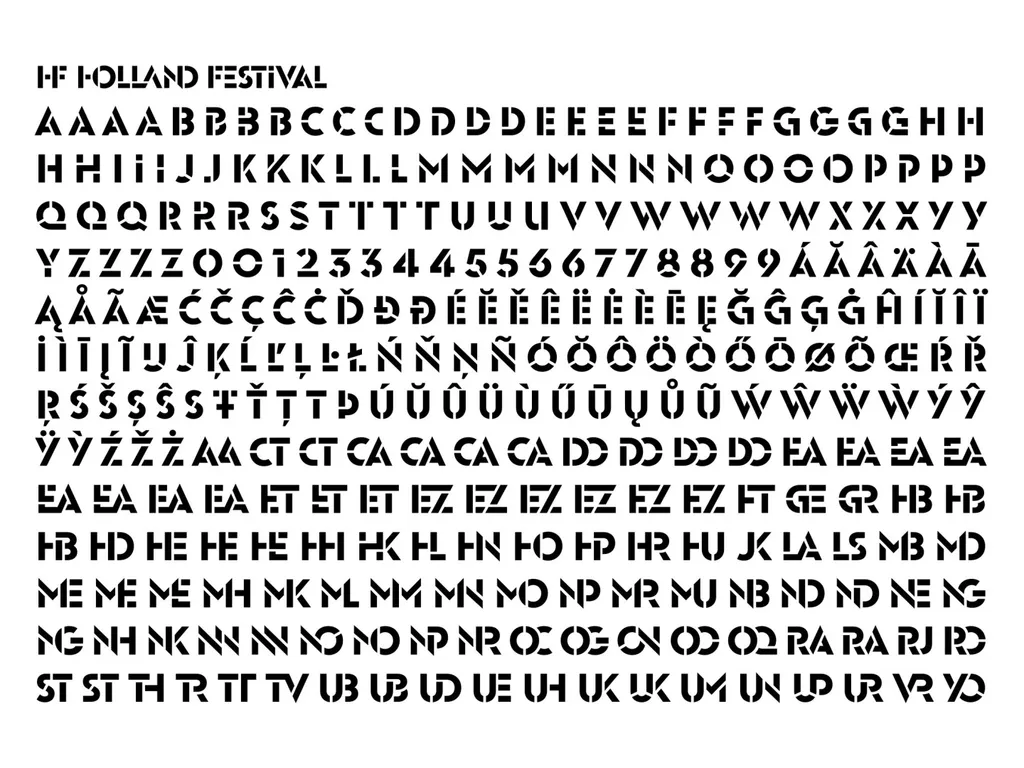
Based on this ligature + stencil result, thonik then created a whole new typeface in collaboration with font foundry Bold Monday. thonik has worked previously with Bold Monday for the typefaces they developed for the Royal Theater Carré in Amsterdam and Dutch Television network VPRO.
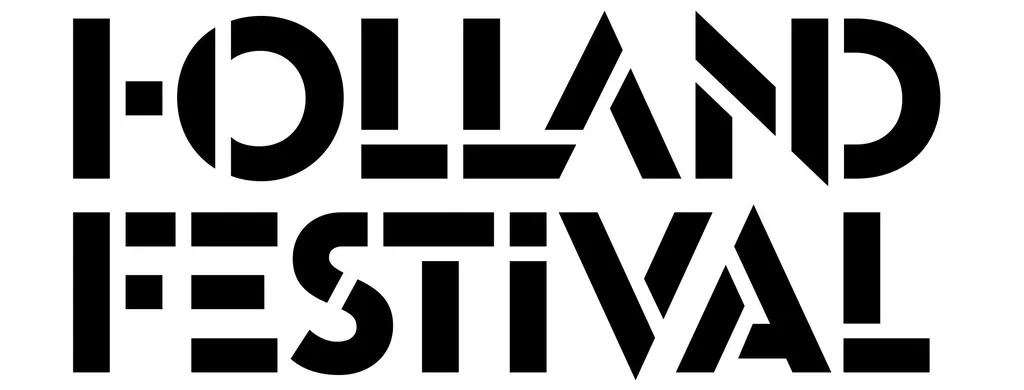
The results for the Holland Festival are a celebration of elementary forms with a festive atmosphere using graphic language that travels seamlessly across all communication formats.
Of course the content of the festival will also become part of its visual communication, says thonik’s co-director Nikki Gonnissen.
“But we felt that since the art images merge with information then the typography should also be reworked. Now the photography and the typography are both altered so the interaction becomes meaningful.
For this first thonik edition of the Holland Festival dubbed the “Festival Edition” the colour palette is a strong green and blue with a paler contrasting pink. Green stands for a renewed spring and a clean idea. “A fresh impulse from a new creative director,” explains Gonnissen. And blue is the night sky – an evening out at the theatre.
Further Info
*thonik used Euclid Flex, a Swiss typeface as a starting point for the design of the HF ligatures – a ligature is a combination of letters designed to formally interact.
Find the project page here.