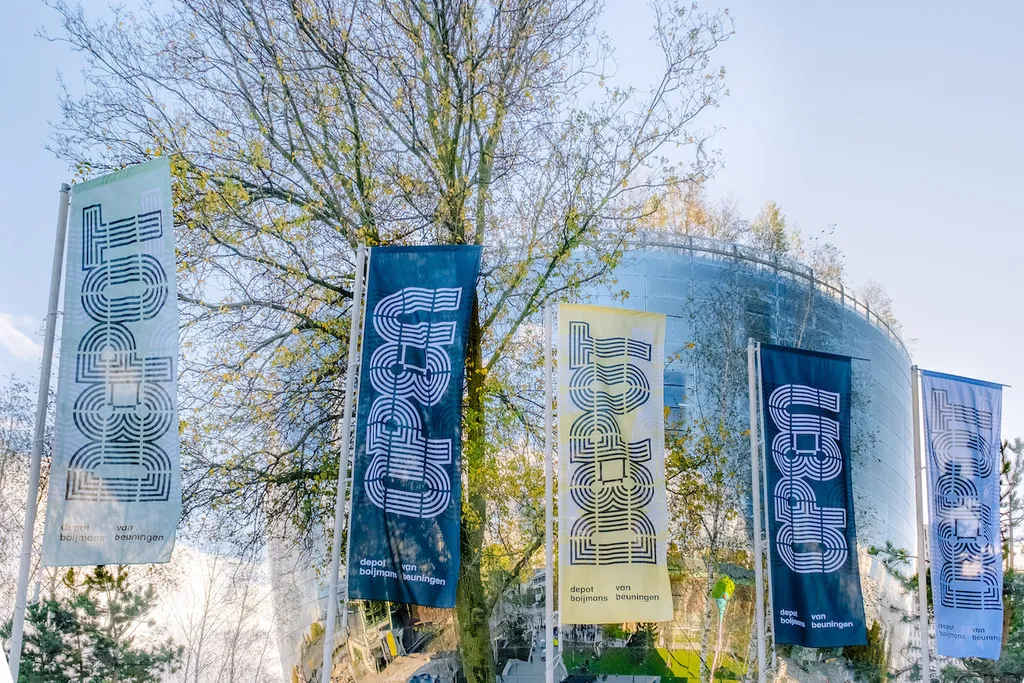
1,664 mirrored panels cover the surface of the Depot Boijmans Van Beuningen, a globally acclaimed design by MVRDV. This Depot (popularly called The Pot) is the first in the world to offer access to a complete collection. The dynamics of the Depot are different from those of the museum: no exhibitions are made here, but you can – independently or with a guide – view the collection consisting of 151,000 art objects. You can also take part in, for example, conservation and restoration.
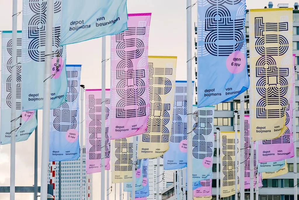
After 12 years of successful communication with a three-line letter for Museum Boijmans Van Beuningen, the new identity for the Depot had to build on this but also distinguish itself from it.