On September 24, 2020, the day that Museum Arnhem celebrated its 100th anniversary, the museum introduced Thonik’s new corporate identity, which we rolled out further in the run-up to the reopening of the museum just before the summer of 2022.
open: Museum Arnhem
On the homepage, the graphic identity interacts with the visuals. The dynamic, well-balanced logo we’ve designed specifically for the web becomes more modest and simple as you scroll down. In this way the logo gives full scope to the program, which also distorts in word and image.
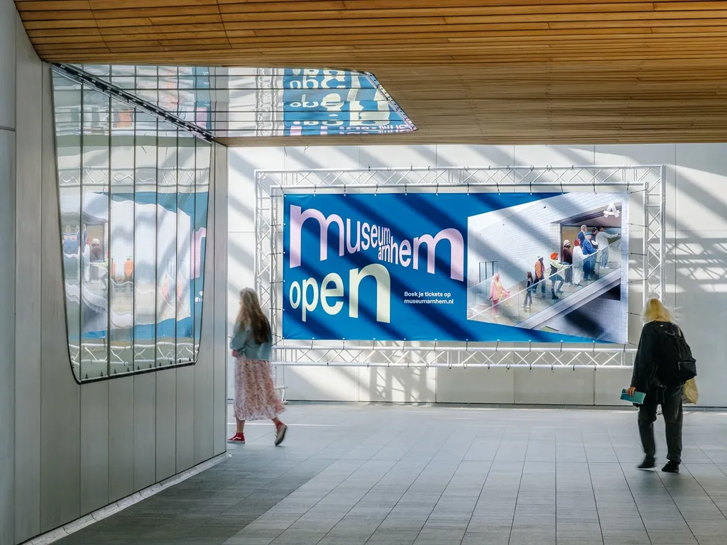
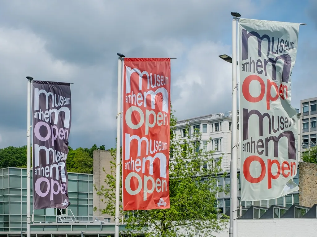
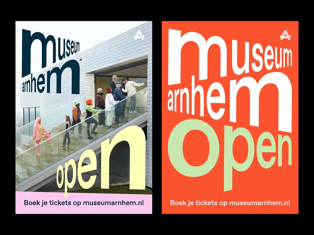
The different perspective fonts that arise from the logo allow the viewer to look from different perspectives. The idiosyncratic color palette of purple, stone orange, warm yellow and a special green ensures a unity in communication. Together with the fonts, they represent the identity and commitment of the museum: Museum Arnhem connects art and society from various perspectives.
Further Info
Related Stories
Adventurous Navigation
Museum Arnhem
Photography
campaign image: Henk Wildschut
city dressing: Thijs de Lange