Roy Terhorst becomes a partner at thonik

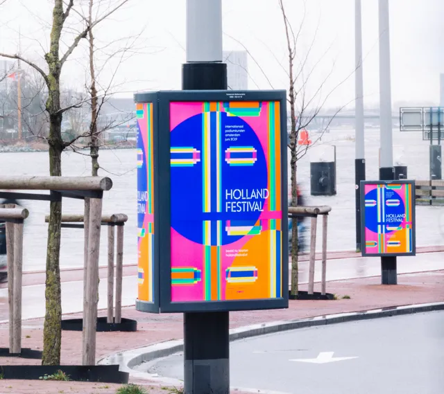
Roy Terhorst is a multi-disciplinary designer specialising in graphic and motion design. He joined thonik in 2012 and has worked on projects for the City of Amsterdam, The New York Times, Nanjing Youth Festival, Holland Festival, Design Society Shenzhen and Dutch public broadcaster VPRO, among others. Thonik’s approach as a studio has always been about getting to the core of a topic and creating a clear, simple and radical concept that results in a rich and experimental visual language. “In the studio we always talk about how you need rules to create a strong identity,” says Roy. “Once you have those rules in place however, you can break them.”

Earlier this year Roy became a partner at thonik, the first partner the studio has had since it was founded by Nikki Gonnissen and Thomas Widdershoven back in 1993. To mark the occasion, we asked Roy a few questions about his approach, why he thinks experimenting and play is so vital, whether print is dead and what he is working on right now.

When did you know you wanted to become a graphic designer?
In my late teens I ended up at art school (AKI) in Enschede. I had gone to study photography but then saw my friends in the visual communication department making all this cool stuff, not only with photography, but also with text, layouts and animations, and it was then that I realised I wanted more. I switched programmes and fell in love with all the possibilities this field offered. It was as if a huge playground had opened up for me.

Can you expand on the importance of play in your approach?
At a studio we always start with a concept. And from that concept all logical steps for the visuals are extracted. But on the other hand, there is also the urge to play and start from, or with, a form or shape. And there is a certain freedom in this way of working because anything can happen. As you try out new stuff, new worlds can be discovered. By just getting started and not insisting on having total control over the outcome, you increase the chance of those famous ‘happy little accidents’. I love those moments, they’re addictive.

Studio thonik has always had a conceptual design philosophy.
How does your experimental and playful approach feed into this?
Sometimes the experimental work is so strong we think it should be used for a project. But it needs a topic that fits because fundamentally our belief is that our projects should be logical, radical and meaningful. When we combine this philosophy with experimental work, interesting stuff happens. Play feeds the conceptual thinking in everything we do.

What project(s) are you particularly proud of and why? In 2019 we did an exhibition around the launch of our book ‘Why We Design’. For this exhibition we turned the book into a motion installation; eleven rooms, eleven projections and eleven reasons why we design. The exhibition focused on motion graphics, animation and other time-based media. Visitors were invited to submerge themselves in our way of thinking by passing through the moving images. Alongside this exhibition we did a workshop with design students. Our new studio space is perfect for workshops so we definitely want to host more of them in the future!

The importance of motion design seems to have shifted. Instead of the motion work growing out of a two-dimensional or flat piece or idea, the process has been reversed.
Yes, it has shifted. Even just a few years ago a poster was designed in a static format and this static version was translated into an animated piece. Now, at least for us, it is the opposite: the static poster is a still from the motion design. And we often use motion design as a starting point with new clients. When something is in movement it is easier to read and understand all the possibilities. It’s easier for people to get excited about it too.

roy-becomes-a-partner.png

Does that mean that print is dead?
Not at all! For us print is very much alive and actually getting more interesting again. Since motion is a starting point for print, interesting things are happening. The posters you see around are more experimental, unexpected and original. Ironically, motion design has given 2D design a new lease of life.

You like to work with letters. Can you explain why?
I love letters because first of all it’s about communication and letters are a tool for designers that everyone can understand. But letters can also be playful and used to create visual puns. They can be figurative or personal and feature artistic experimentation; or they can be aesthetic or ugly. You can put a lot of identity in them.

What are some future projects you will be involved in?
In May I will give an online talk about how my experimental approach relates to our projects at Typomania Festival in Moscow. At thonik we are also working on a new identity for Dutch Design week, a client we have wanted to work with for a long time! The news has not been made official yet, so this is a little sneak preview for our newsletter readers. Our design will involve a figure who is a hero for many designers around the world.

I will also be co-curating an exhibition to be held in Shenzhen, China later this year that will be focused on everything we think is interesting in the worlds of graphic and motion design.  It’s still in the early stages so I can’t tell you more for now.

1.jpg

What would you say to someone wanting to get into graphic design now?
Avoid endlessly scrolling through Instagram and liking everything, search for something you really find special and start collecting it by saving the images instead. This way you can develop your own taste and likes and dislikes. It’s useful to know a bit of art history but I think art schools should also teach (graphic) design history. Not only to see what has already been done by whom and when, but on a deeper level, to help people find their own taste. Lastly, remember that you learn the most by doing, so just start!

See also