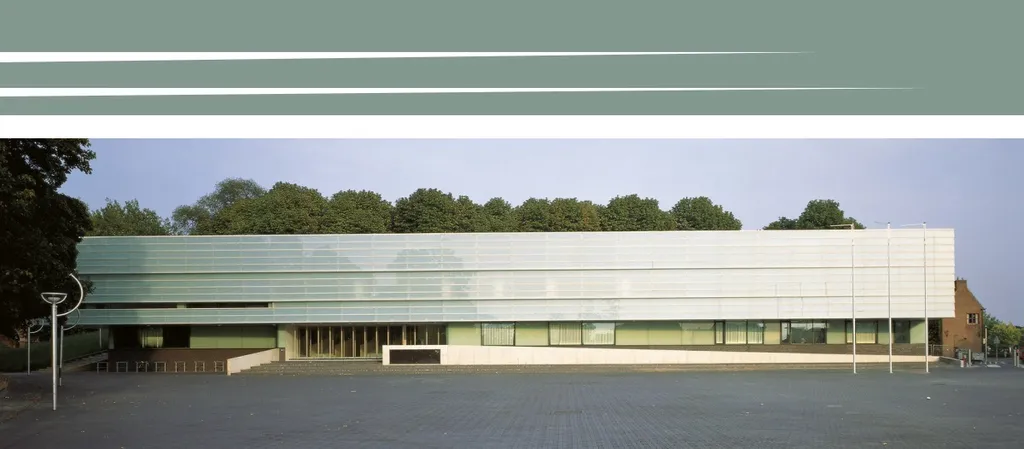
Nijmegen, the oldest city in the Netherlands, is home to the Valkhof Museum. While the main museum is closed for renovation, a temporary location has just opened its doors in the historic heart of town. The metamorphosis of the museum goes beyond just a physical transformation, as a new direction is also being undertaken. Our task: to give this new direction a visual identity and website that will capture the essence of the museum’s exciting new chapter.
the new Valkhof Museum
The Valkhof Museum’s new direction can be best captured by the word transhistorical’. With a collection of archaeology, old, modern and contemporary art, the museum tells stories that break boundaries and make surprising connections between different eras. The museum’s collection tells stories about life in the past, but also about our lives now. We developed our visual concept around the dynamics of switching between different collections and eras.
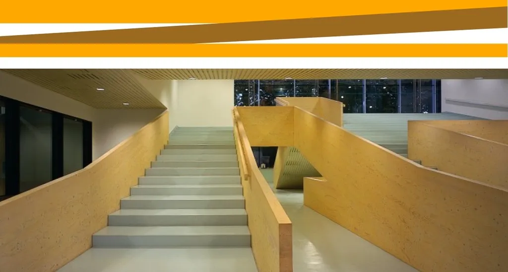
We also found inspiration in the building itself, observing how its windows were slightly skewed and more importantly: how it consists of different layers. We realised how these layers could be translated to a visual concept that refers to earth layers and literally going in-depth. This layered concept works very well for a museum that’s famous for its archaeological finds, yet also represents the transhistorical new direction – all the layers of history and the crossovers between eras.
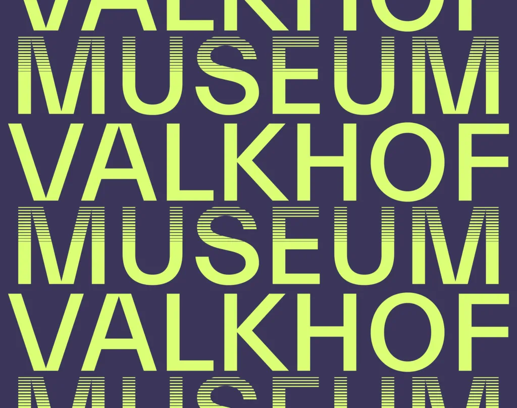
We selected earthly tones inspired by the location itself and referring to earth layers as the color palette for the website. The logo has a layered feel to it, further explored in a visual language that connects images and texts from different eras. The horizontal lines in the logo work as shading, which is more irregular in the graphic style of the website, using coding to generate visuals.
We chose the Everett font, designed by Swiss designer Nolan Paparelli, for its peculiar letters A, N, M, V, and W, which make the logo balanced and memorable, giving the website a unique feel. Together with the characteristic color palette, the website expresses historical depth and urgency.