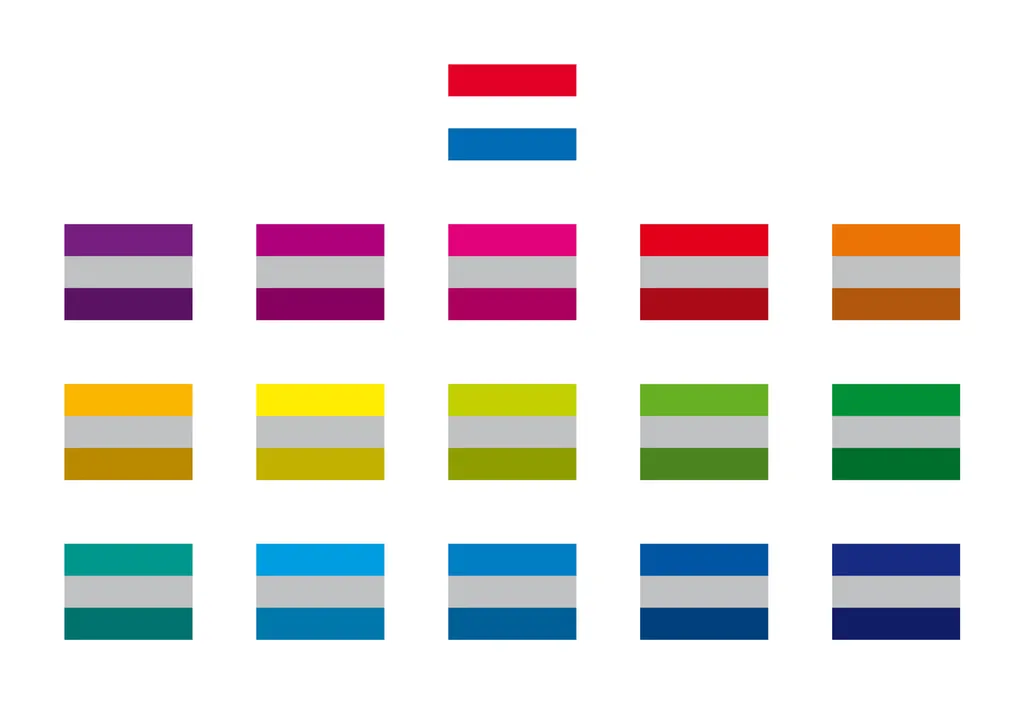
Amsterdam-based design agency Thonik talks us through its flag-based identity for the Netherlands Government that never managed to leap past the pitching stage.
thonik on the Netherlands government identity that never was
“The national government was using different logos for each one of their ministries. In Holland each of the ministers has their own department, and each department had its own identity. They needed a clear goal; we made a plea for something that unified it all.

We thought we should find something that all the citizens of Holland would see as being “Dutch,” without being overtly nationalistic. In Holland, nationalism is seen as a bit of a dirty word; we’re very close to Germany and France and we’re a very small country, so it was better for us to be less oriented towards obvious nationalism. On the one hand are people who are concerned about international development as they feel they’re losing their jobs, so we have to make something that’s more careful about their concerns but not bring it in a direction of xenophobia.
The Dutch flag is flat and egalitarian, and expresses the country, but we saw it also as a riddle to organize the type and subjects: if you have the government and all the departments and subdivisions, it’s a lot of information you have to organize. Since we have these flat lines, we thought, we can use them to make a rhythm. So we used the emblem of the flag as an organizer of information and opened it out of the contour, giving it white and no borders.”
Read the full story on Aiga Eye on Design.
Further Info
This is an excerpt from an article from “AIGA Eye on Design” by Emily Gosling, originally published on January 31st, 2018.