by Nikki Gonnissen
Visible Culture
I wish there was more culture in what is visible. A lot of what we see are commercial expressions. Since all that is profit driven it reduces human interaction to financial transactions. A city street lined with shops and posters only creates space for trade. Trading is the opposite of sharing and isn’t the public domain not much more about what we share?
Noise, colour, pattern and typography constantly compete for attention. The market needs its communication to be as visible as possible to be effective. The end result of this can be a confusing, or worse, hostile cityscape. When every design is vying for the most attention, the environment can become aggressive.
To be visible seems equal to being commercial. But I see this differently. Visible culture in our work means: making culture visible.
A good example of this is the identity we created for the Holland Festival. We adopted commercial strategies for one of the most prestigious events in The Dutch cultural calendar wrapping trams in graphics, lining boulevards with flags and covering architectural facades with typography.
The Holland Festival ticket buyer normally identifies with more refined stimulation than tram advertising, and oversized billboards. But our city-dressing celebrated the power of international culture, giving the festival a strong presence all over the city.
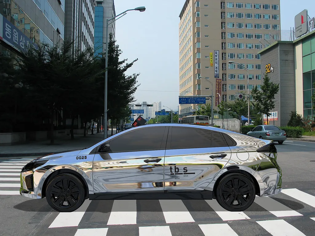
When I visited Seoul in 2015 my eye was caught by the colors of busses and taxis. A lavender blue for the busses and salmon orange for the taxis. It made public transport stand out amongst the white and black cars that were private owned. It was great to see something we share stand out so effectively. To my surprise we were invited to propose a new design for the taxis a year later.
We immediately had a radical idea: why not say to the client to leave the taxis as they are?
Our process is to start with such an idea then check, trace and challenge it to ensure it works on enough levels beyond the immediate. We felt this first idea – however radical it was – fell through because it signified conservatism, and that is a position we do not adhere to. And also: what is public should have a strong presence, but it also should feel like it is ‘ours’. And if all Seoul citizens choose either black or white for their own cars, an orange car is not really fitting to express what they share.
So instead we proposed a taxi fleet of mirrored vehicles that would reflect the city and its people. The mirror stands out, like the orange did. But it sits way better with the general colourless taste. It was ultimately honest, as well as a nod to the flashy, shiny cars of the nouveau riche cruising the streets of London and Dubai. It communicated the wealth and the depth of the city as a public domain.
The Holland Festival campaign was a success, but our proposal for the Seoul taxi never made it past the jury alas, all though it won the public vote in the process.
Further Info
Related work
Holland Festival
Mirror taxi for Seoul