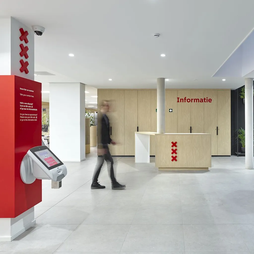
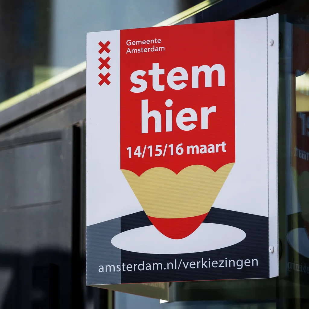
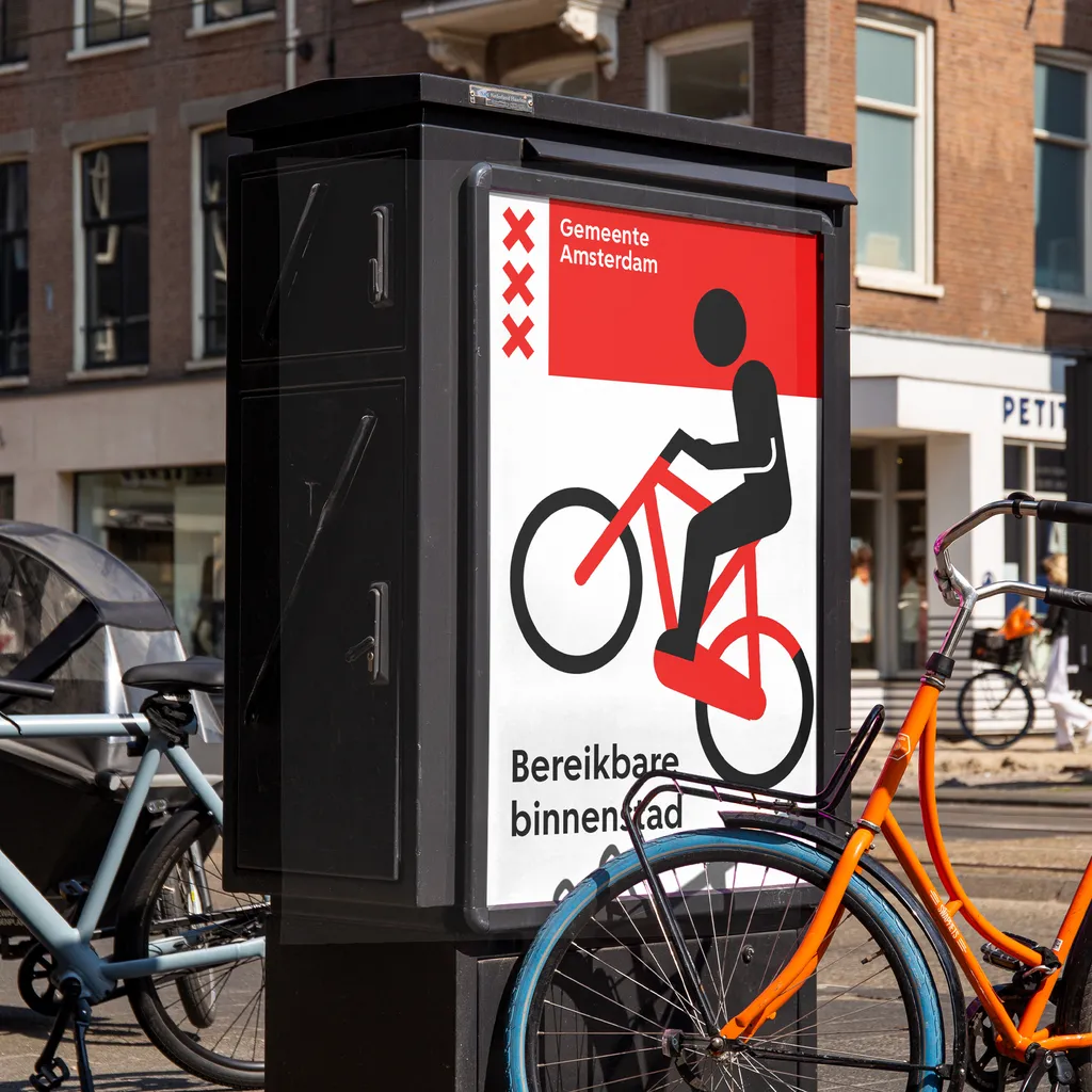
Visible and accountable
Gemeente Amsterdam
In the early 2000s, Amsterdam faced a challenge: its visual identity was scattered across over 50 logos, leading to confusion and a sense of disconnection. This fragmentation highlighted a need for a unified approach that could better represent the city's heritage and values. Recognising this, Amsterdam set out to consolidate its identity, choosing the historic three crosses symbol as the centrepiece of a new, streamlined visual language.
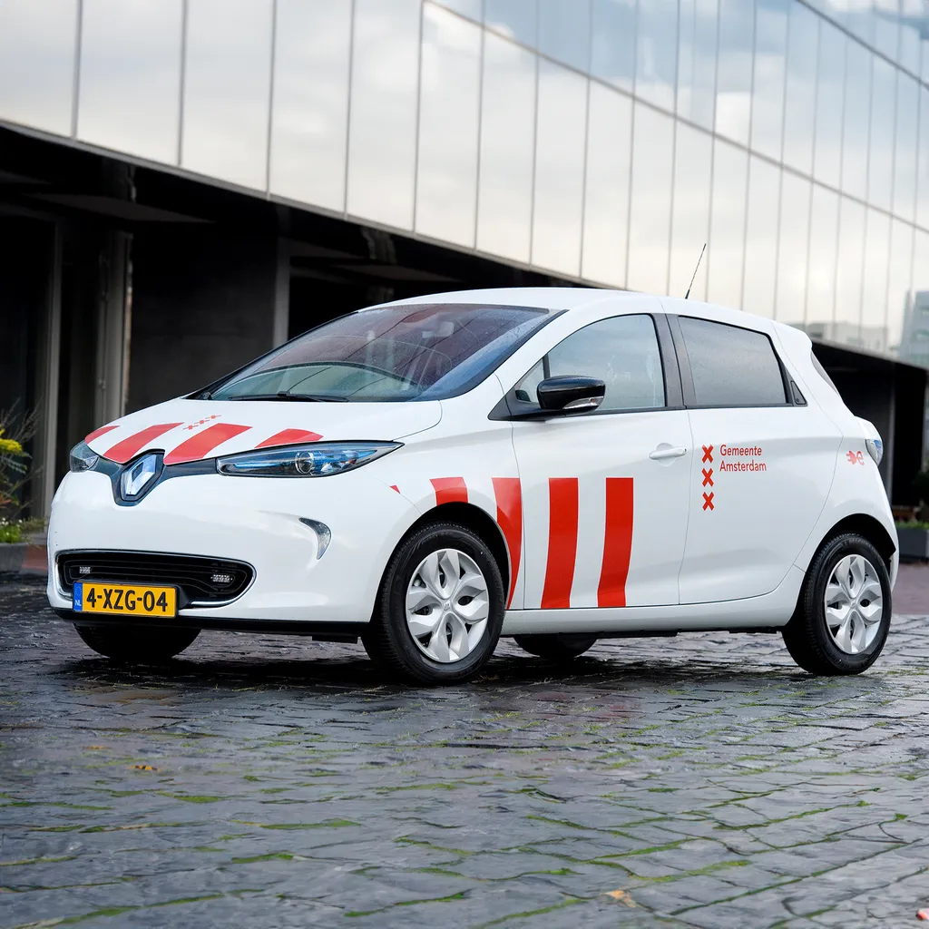
“Among other things we’re going from 250 different types of envelopes to a maximum of 25 types of envelopes, to one unified letterhead and to one type of fleet marking. By doing this we can purchase items in larger quantities which makes them cheaper in the long run.”
“We are very satisfied with the Amsterdam Style after 10 years of use. The style is flexible, communicatespowerfully and contributes to a recognizable government.”
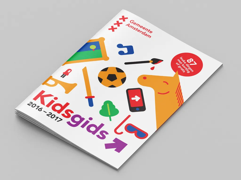
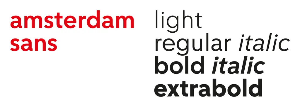
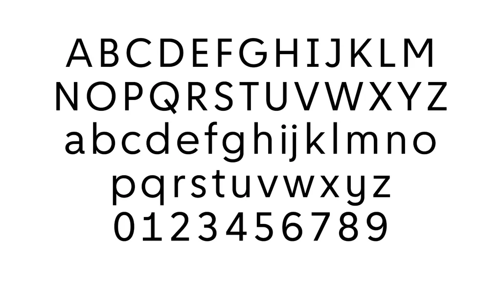
Open, adaptable and inclusive
Together with Bold Monday we developed a new bespoke typeface. This typeface was designed as a successor to Avenir, providing enhanced readability and a design more in tune with the city’s emblem, optimised for digital communication. Amsterdam Sans stands as a testament to the enduring collaboration between the city and its designers, seamlessly blending tradition with the demands of the modern era. It encapsulates Amsterdam's commitment to openness and adaptability, ensuring its communications are not only unique but also inclusive.