thonik
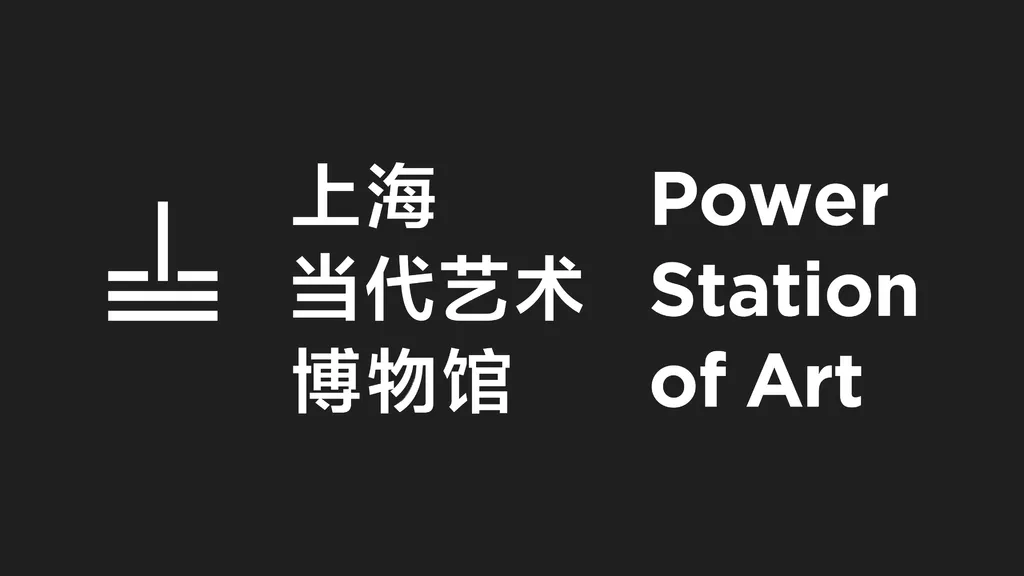
Power Station of Art
Shanghai
Services
Strategy
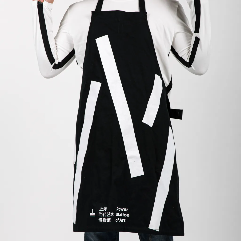
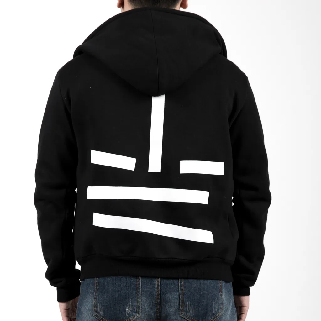
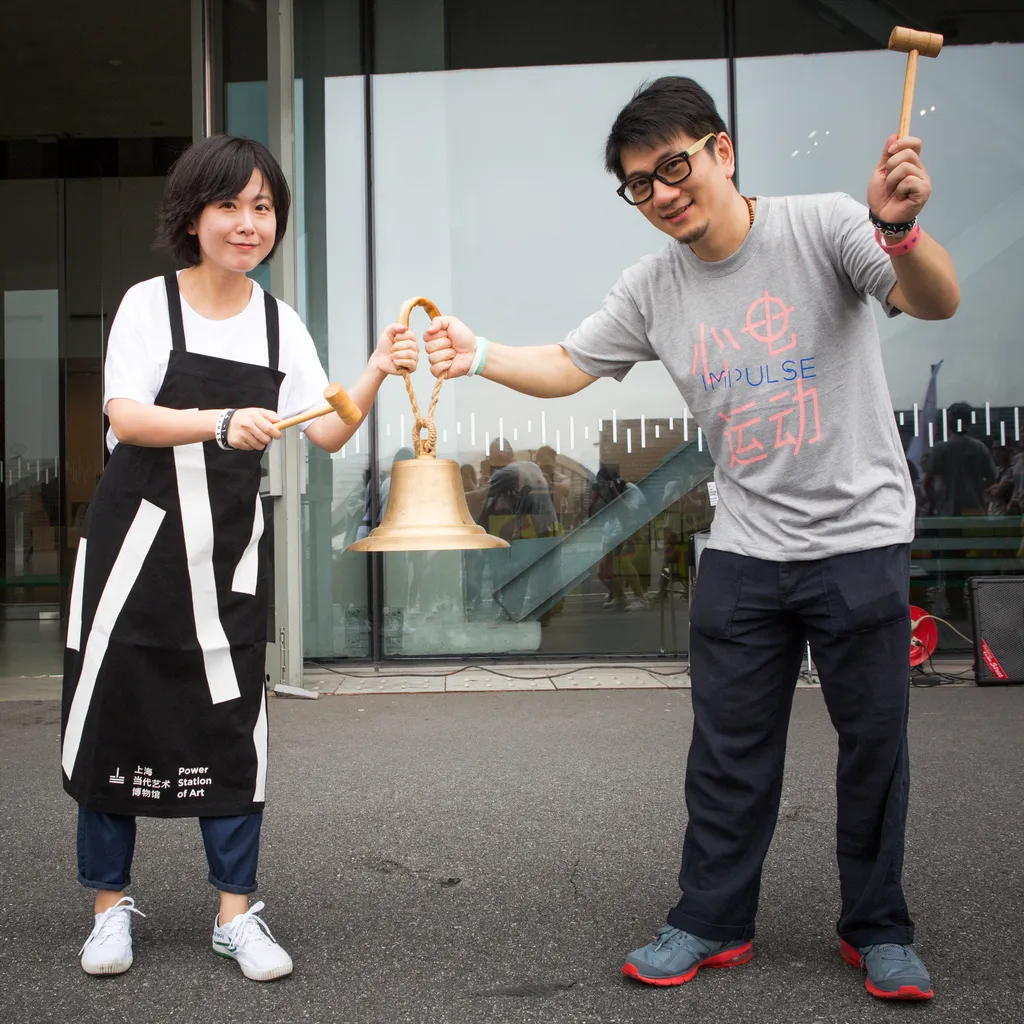
Visual Identity
Motion design
Campaigns
Wayfinding
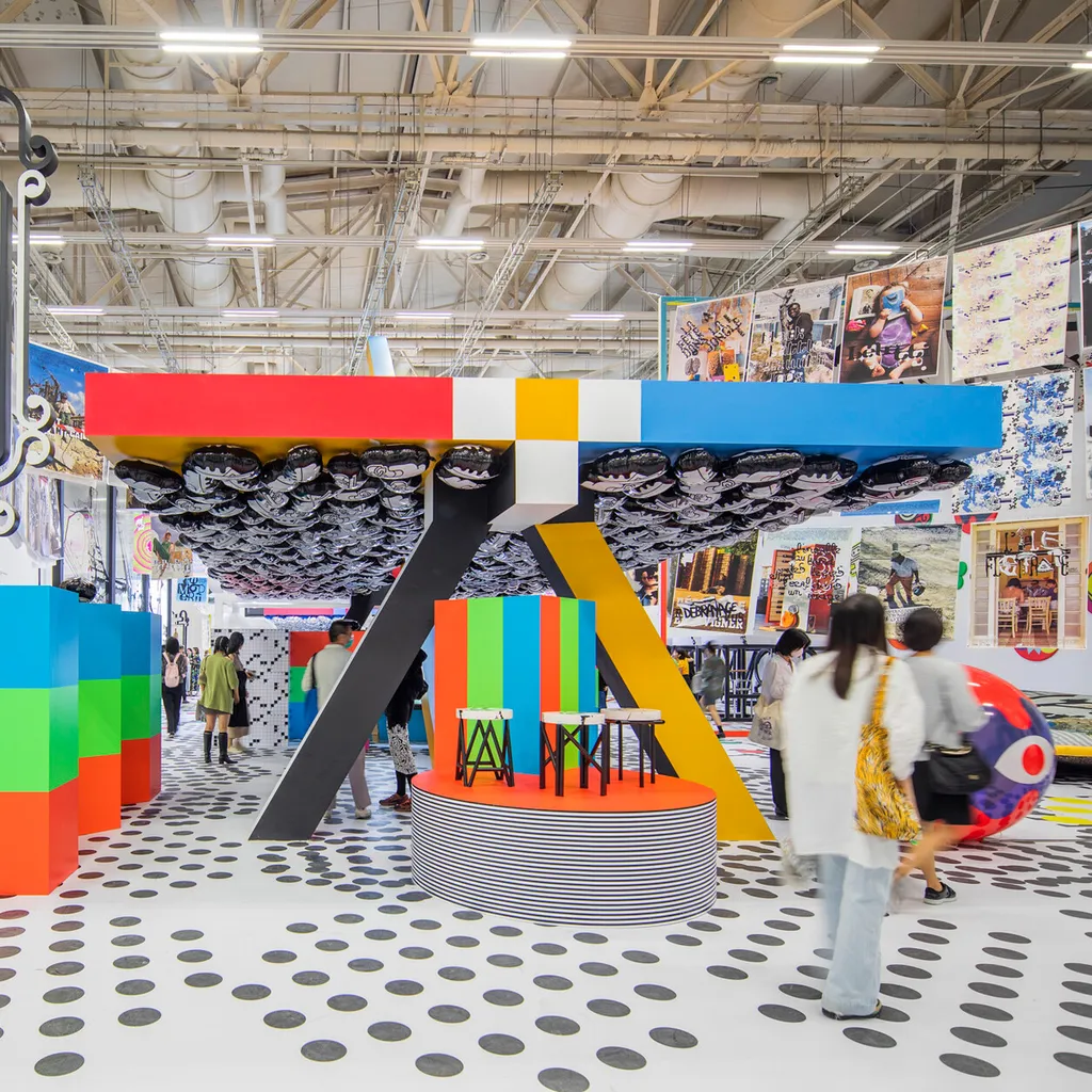
Super Graphics
Website
Field
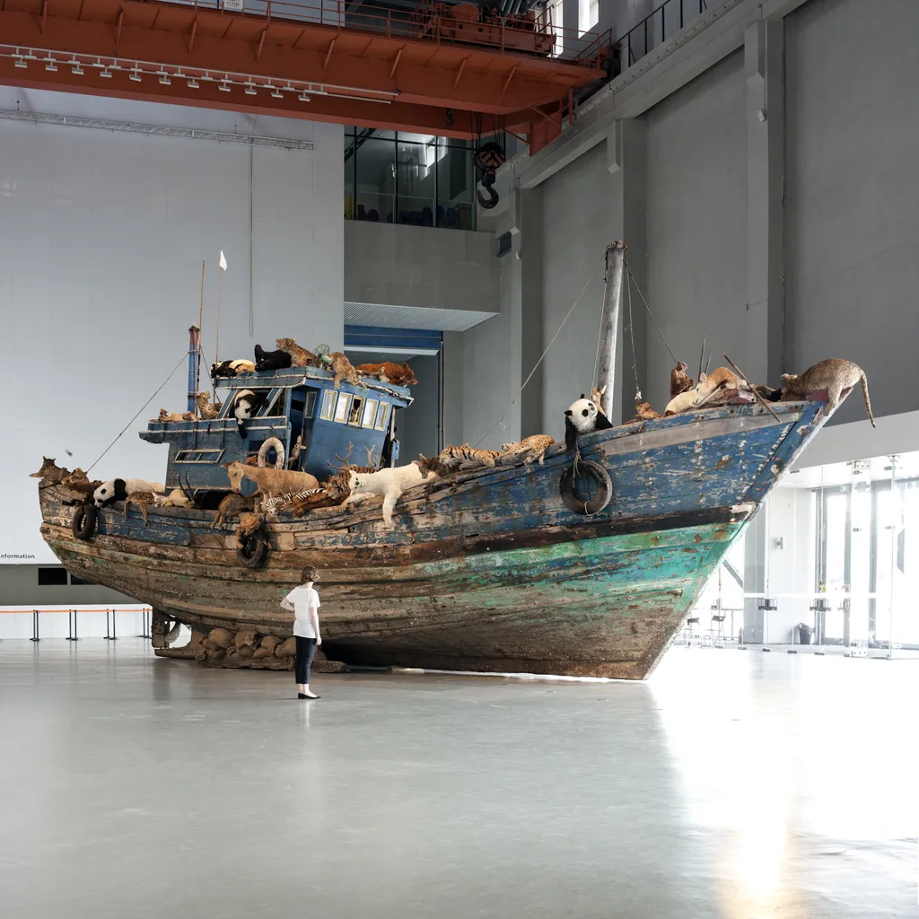
Arts & Culture
Empty Image Block
Image (Stationary)
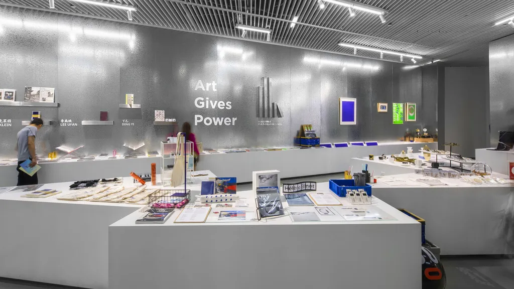
Interiour
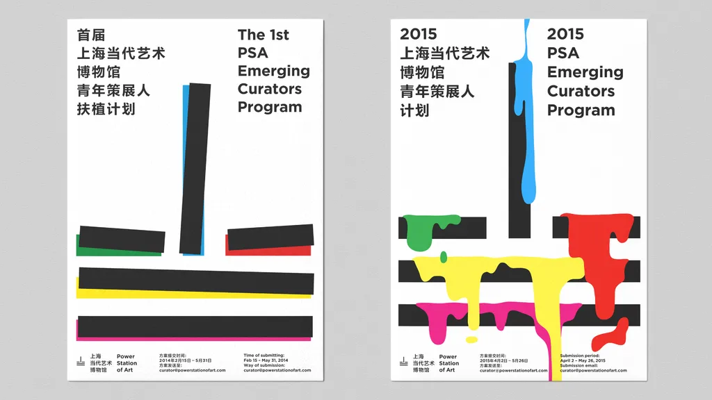
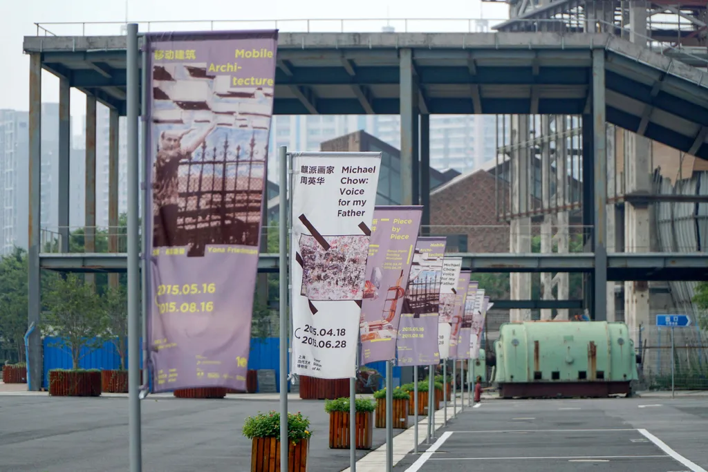
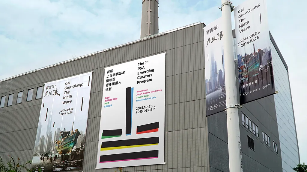
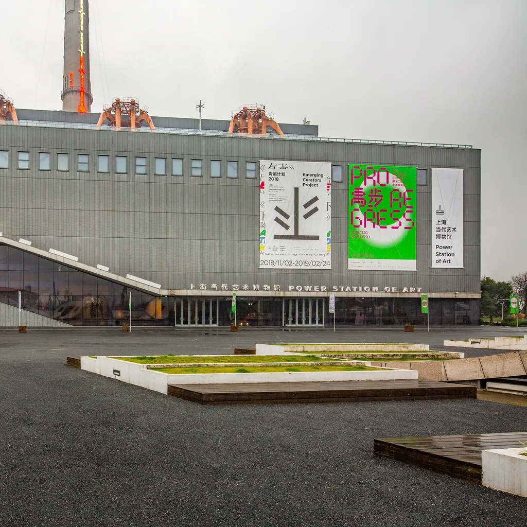
Campaigns
Empty Image Block
Empty Image Block