thonik
the power of design
go for impact
Your ambitions get realised through integrated design. Together we will unite stakeholders to accelerate your impact.
how we work
work
go to work
Visual Culture in Hong Kong
M+ Museum, Branding and Campaigns
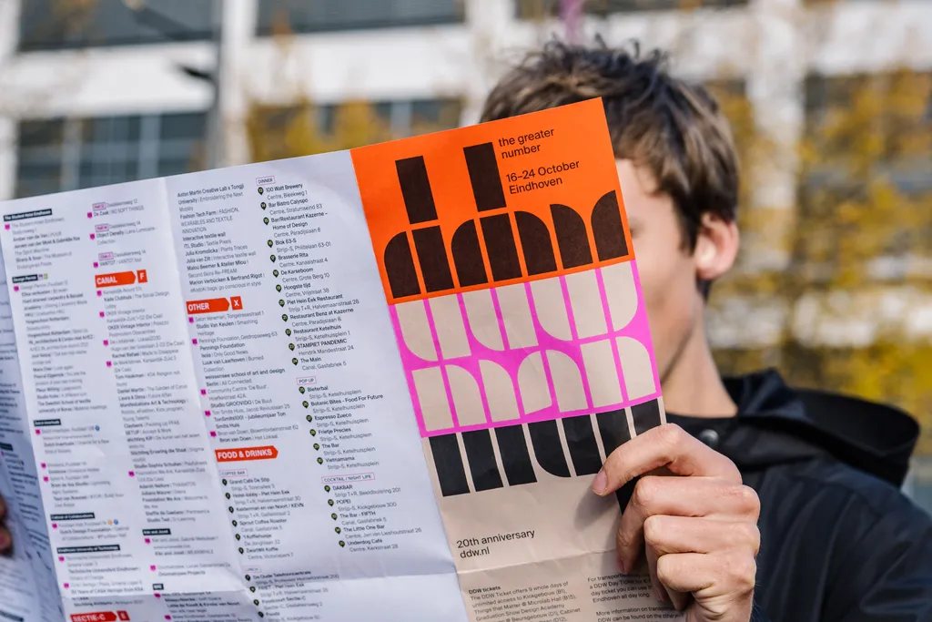
Gather here all you design lovers
Dutch Design Week
Integrated Communication
Depot Boijmans Van Beuningen
Changing the face of Dutch Television
kro-ncrv
Transhistoric Storytelling
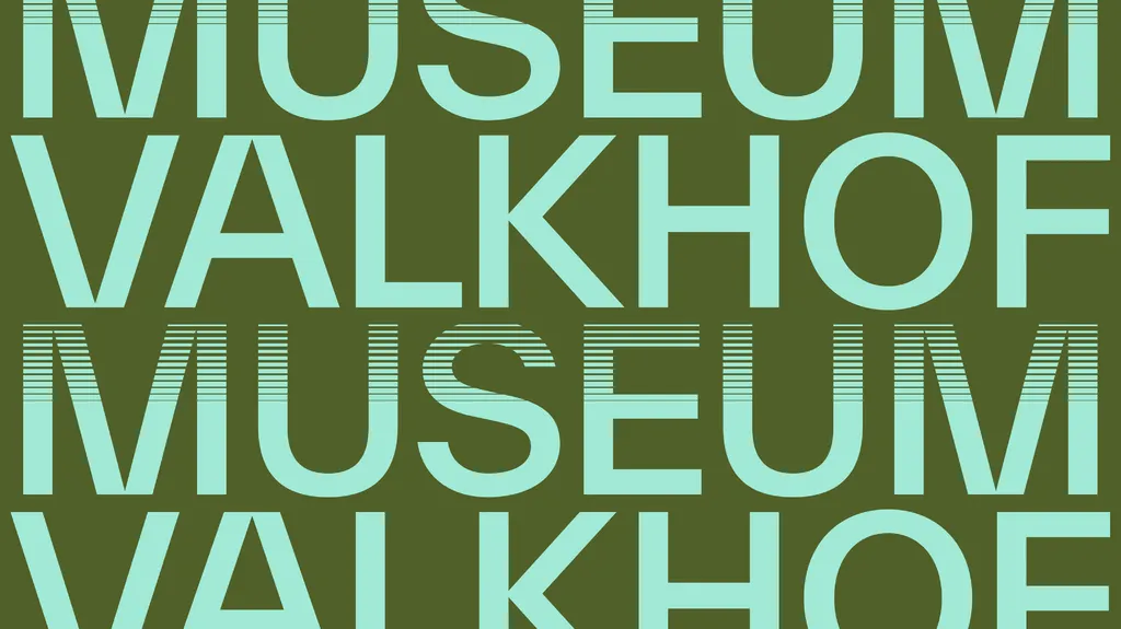
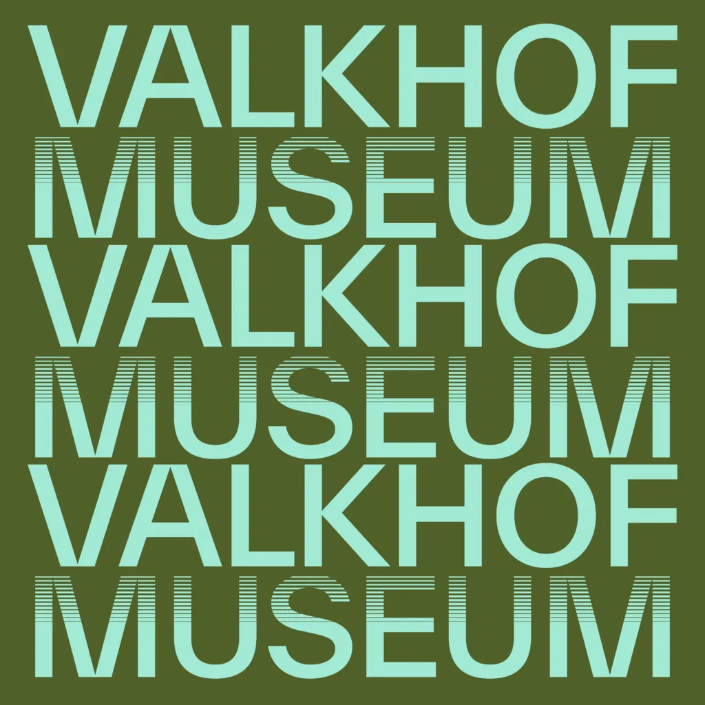
Valkhof Museum
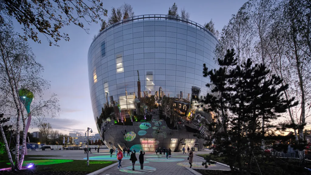
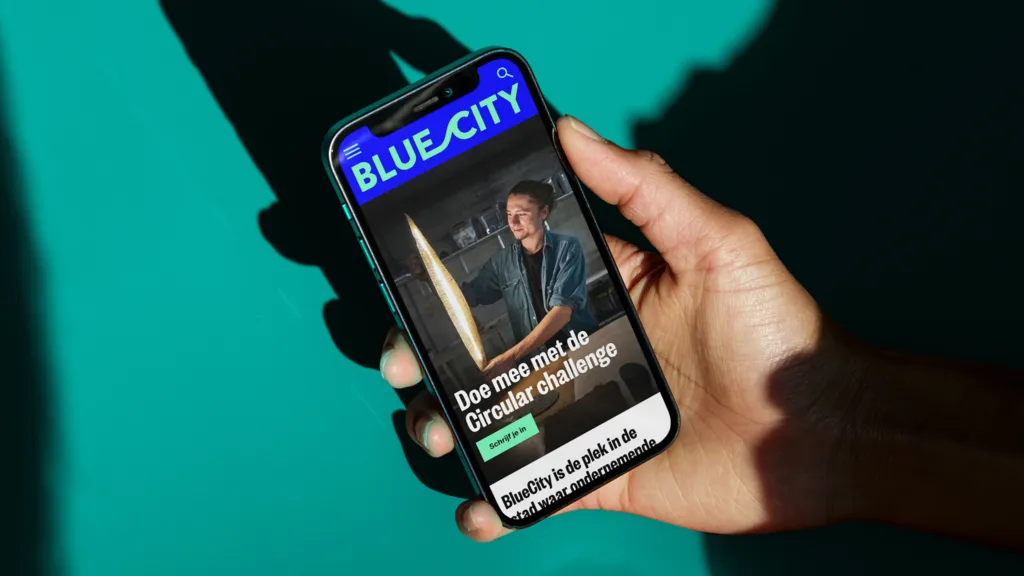
Uniting Sustainable Entrepeneurs
BlueCity
latest stories
go to stories
we're looking forward to meeting you
let’s connect