thonik designs visual communication, scenography and catalogues for the 6th Urbanism\Architecture Bi-city Biennial (UABB) in Shenzhen, China.
woven bags and banners
Re-living the city: the theme of the biennial
The urbanism and architecture biennial in Shenzhen this year, is curated by Aaron Betsky, Hubert Klumpner & Alfredo Brillembourg (Urban Think Tank) and Doreen Heng Liu. The theme is re-living the city. It researches and advocates a new way of urbanism: bottom-up, with a focus on the existing situation. The city is not in need of big plans, handed top down. Instead small interventions make a difference to better city life. The city is a playground for designers, as Aaron Betsky speaks about a hunter and gather mentality.
Re-use: the concept of the logo
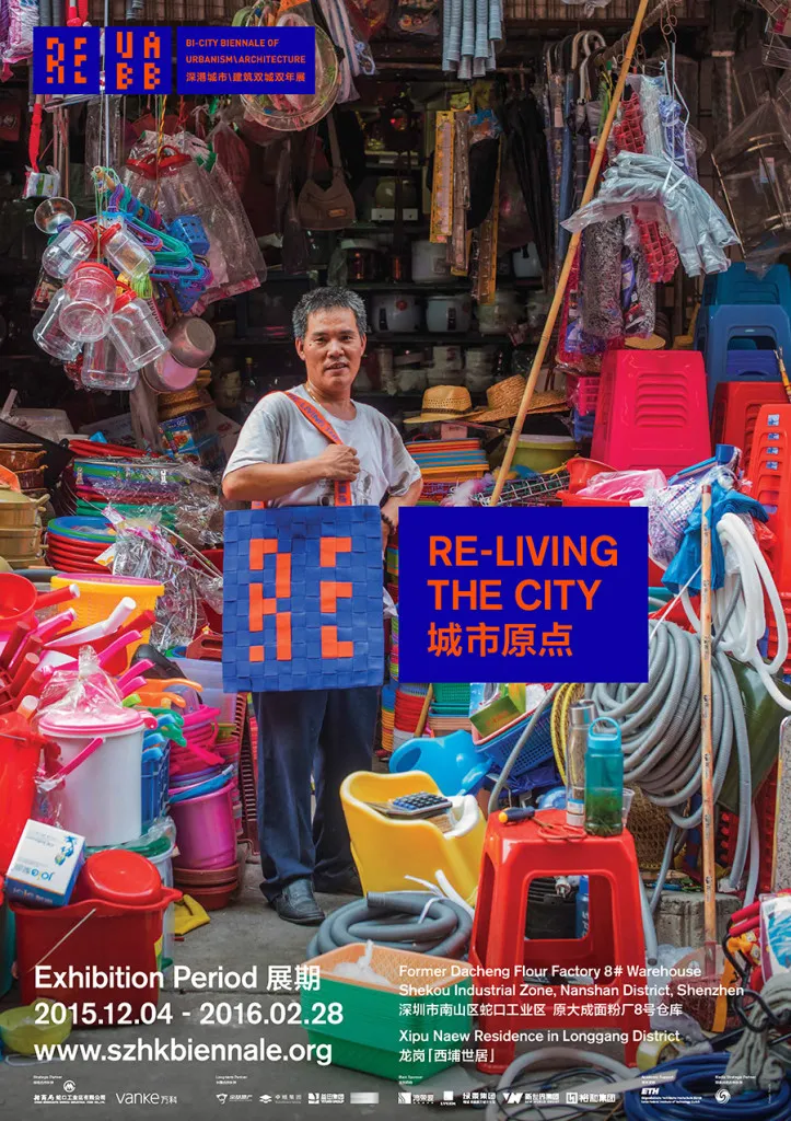
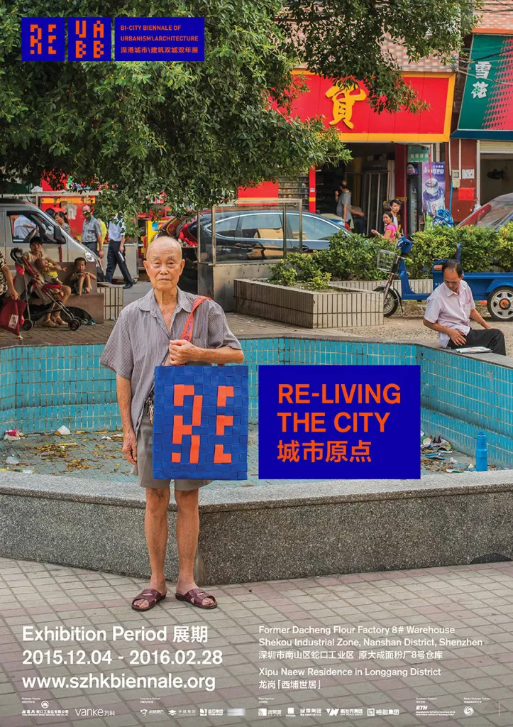
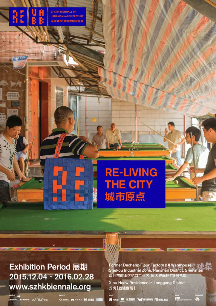
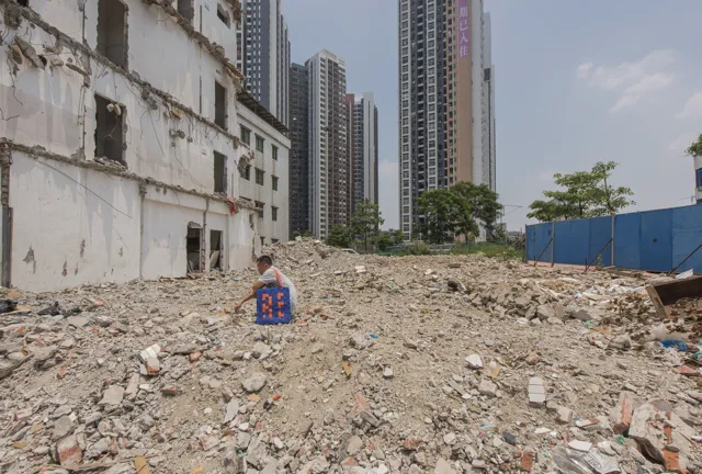
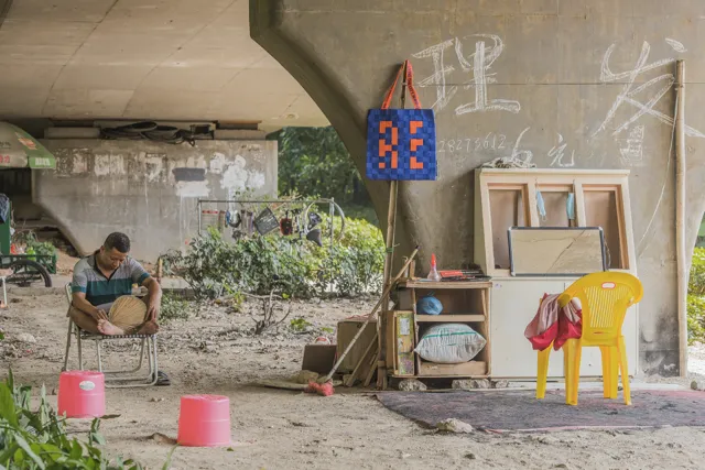
The start of the visual communication lies in re-use. thonik re-uses the overall graphic language of the UABB, adding bright blue and orange as colours that intervene and highlight in the urban environment. The new logo is reduced to two letters: RE, signifying the theme. The block typography and block logo stand out easily in the visual chaos that is linked to the modern city and the biennial’s location in Shenzhen: a deserted industrial site along the Shekou harbour. For the implementation of the visual communication design, thonik collaborated with the Guangzhou based design group Another Design.
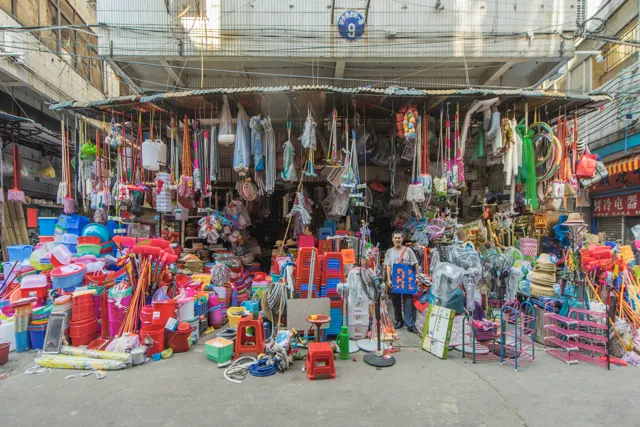
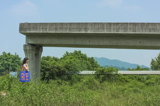
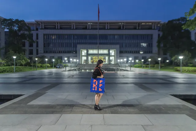
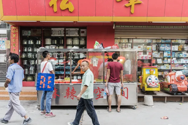
Woven bags: visual essay
As a next step in the communication project, thonik designed a woven bag. The bag functions as a symbol for hunting and gathering. In collaboration with Hong Kong based designer Connie Lee we produced the bag and with photographer Swkit we made images of the woven RE-bags on the streets, carried by citizens of Shenzhen; a photographic essay in which we looked for a social and informal city. The photos are used on posters, book covers and social media.
Woven banners: scenography
The weaving of the bag was further developed into a specific typeface, a woven one, designed in collaboration with Zigmunds Lapsa. This typeface is used throughout the exhibition in large woven banners, which mark the beginning of the sections in the exhibition and again refer to the woven network of a city.
thonik is an Amsterdam based design studio. During the last 10 years, thonik did important projects in Asia. Amongst these are the Power Station of Art, Shanghai; Nanjing Youth Festival and Spiral Art Centre, Tokyo. thonik designed the Architecture Biennial Venice in 2008, in collaboration with Aaron Betsky.
For the 2012 UABB edition, thonik and Duoxiang Studio collaborated on the design of the Dutch pavilion. This presentation was awarded the 2011 Shenzhen & Hong Kong UABB Organizer Committee Special Award.
Further Info
Date
04-12-2015 till 28.02.2016
(opening today: 04.12.2015)
Opening times
Tuesday – Thursday 11.00-18.00 hours
Friday – Sunday 11.00-20.00 hours
The Biennial is closed during the Chinese New Year, 7-13 February 2016.
Location
Shkou Shenzhen, Former Dacheng Flour Factory
Photography: Swkit and Maurice Boyer, 2015
Find the project page here.